

Delphi, C++ Builder & .NET Part of sgcUI

sgcToolbar, the Toolbar and Status Bar for Delphi, C++ Builder & .NET

Build the frame of a desktop application with two controls that look the same on every UI. A toolbar with buttons, toggles, radio groups and dropdowns, and a real status bar with progress and indicator panels that a worker thread can update directly.

VCL, FireMonkey, WinForms, WPF, AvaloniaStatus bar updates from any threadFree .NET Community editionIncluded in sgcUI Standard
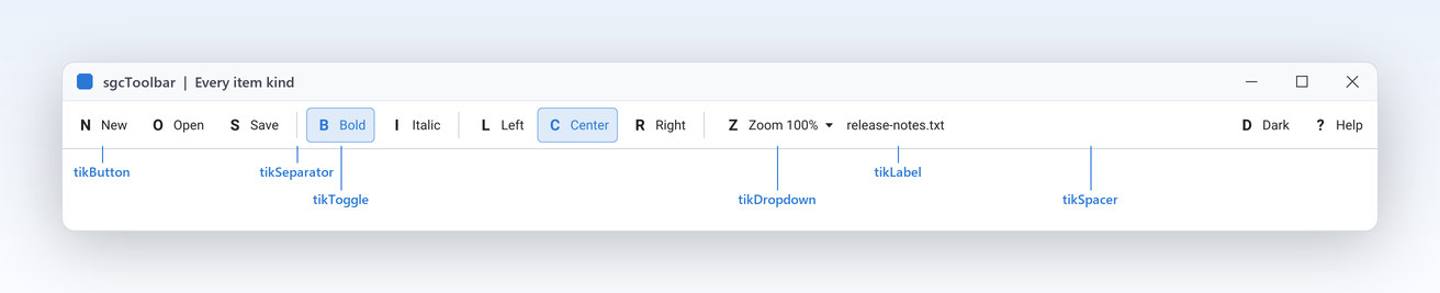
EditorShell toolbar at 2x with callouts on a button, toggle, separator, drop down, label and spacer

A Complete Command and Status Bar

Twelve features for the two bars every desktop application needs, from radio groups to live progress from a worker thread.

Commands

Every item a command bar needs, with the grouping, menus and overflow handled by the control.

Every toolbar item kind in one control

Commands

Every toolbar item kind in one control

A real application toolbar mixes plain buttons, buttons that stay down, buttons with a menu, separators and a bit of text. With sgcToolbar each of them is one item of the same collection, and Kind decides how it is drawn and how it reacts. Items are laid out left to right with Spacing between them, and a spacer takes the free width, so you can push Help or a user name to the right edge without any layout code. Width fixes an item when you need a stable size. Hints, disabled states and hot tracking are drawn for every kind.

  • tikButton, tikToggle and tikDropdown for commands
  • tikSeparator draws a thin vertical line
  • tikSpacer pushes the following items to the right
  • tikLabel shows text inside the bar
Read the help topic
Radio groups with no code

Commands

Radio groups with no code

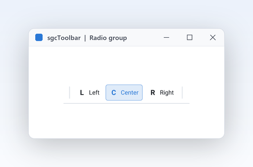
Text alignment, view modes and drawing tools are classic one of many choices. Give several toggle items the same GroupIndex and they form a radio group: setting Down on one of them, by a click or from code, releases the others, and a click on the item that is already down leaves it down, so one choice always stays selected. A toggle with GroupIndex 0 is a simple on and off switch such as Bold or Word wrap. The click flips Down before OnItemClick fires, so your handler reads the new state. No event wiring is needed to keep the group consistent.

  • GroupIndex above 0 makes a radio group
  • Down reads or sets the state from code
  • The down state is drawn with an accent tint
  • A linked action drives Down through its Checked
Read the help topic

Commands

Zoom levels, export formats and recent files belong in a menu under a button, not in ten more buttons. A tikDropdown item draws a small arrow after its caption and shows the popup menu you assign to DropdownMenu right below the button: a TPopupMenu in VCL and FireMonkey, a ContextMenuStrip in WinForms. OnItemClick and the item OnClick fire before the menu opens, so you can fill or check its entries first. If the menu is freed, the bar clears the reference for you. One click target, one menu, and a toolbar that stays short even when the commands grow.

  • DropdownMenu takes the popup of your framework
  • The arrow is drawn after the caption
  • Fill or check the menu in OnItemClick
  • Works from the overflow menu too
Read the help topic

Commands Registered only

Items that do not fit move to an overflow menu

Users resize windows, and a toolbar that simply clips its last buttons hides commands they need. When the items do not fit, sgcToolbar moves the last ones into an overflow list and draws a double chevron button at the right end. Pressing it shows OverflowMenu, built at run time with one entry per hidden item, and choosing an entry acts exactly like a click: a toggle flips, OnItemClick fires and a dropdown shows its menu. The model tells you what is hidden. When the window grows again, the items return to the bar on their own.

  • OverflowMenu is built for you at run time
  • HasOverflow, OverflowCount and InOverflow per item
  • ItemAtPos reports a hit on the overflow button
  • Compiled under SGC_TOOLBAR_ADVANCED

Community: the items that do not fit are clipped, there is no overflow button.

Read the help topic

Commands Registered only

Reuse your TActions

If your commands already live in a TActionList, the toolbar should not duplicate them. Link an item to any VCL or FireMonkey TAction through its Action property and it follows the Caption, Enabled, Visible, Hint, ImageIndex and Checked of the action. A click executes the action with the bar as its ActionComponent, unless the item has an OnClick handler. The bars call InitiateAction on idle, so a disabled action disables its button without extra code. In .NET the item has Command and CommandParameter for ICommand. One TActionList can drive the toolbar, the main menu and the navigation bar together.

  • Action links an item to any TBasicAction
  • Checked of the action drives Down of a toggle
  • OnUpdate of the actions runs on idle
  • .NET: Command and CommandParameter

Community: handle the item OnClick or the bar OnItemClick instead of an action.

Read the help topic

Status bar

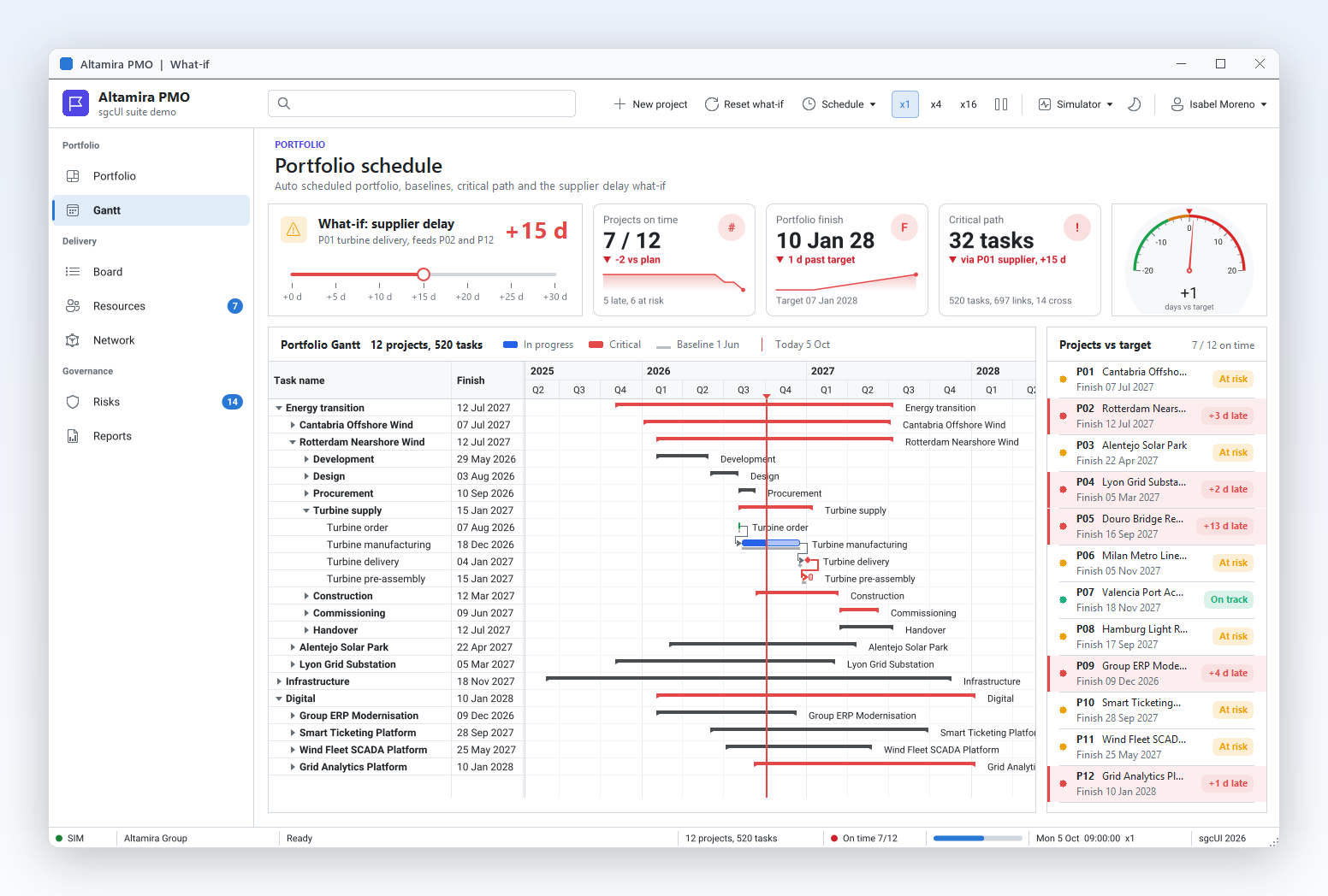
A status bar that lays itself out, shows progress and state, and accepts updates from any thread.

Status panels that lay themselves out

Status bar

Status panels that lay themselves out

Line and column, a file name, the save state and a main message all compete for the bottom edge of the window. TsgcVCLStatusBar lays out its Panels from left to right in three passes: fixed panels take their Width, AutoSize panels take the width of their text, and Spring panels share whatever is left. Use one spring panel for the main message and the bar stays tidy at any window size. A thin line separates the panels, and OnPanelClick tells you which one was clicked. Panels are a collection, so you can add and edit them in the Object Inspector at design time.

  • spkText panels with Alignment and Hint
  • Spring panels share the free width
  • AutoSize panels fit their text
  • OnPanelClick reports a click on a panel
Read the help topic
Progress bars and state indicators

Status bar

Progress bars and state indicators

Long operations need a progress bar, and live connections need a light that says whether all is well. A panel can be a progress bar filled to Progress percent in the accent colour, or an indicator: a coloured dot followed by the text of the panel. IndicatorState picks off, ok, warning or error, with green, amber and red tuned separately for the light and the dark theme. It suits the state of a database connection, a data feed or a background sync. Set Progress or IndicatorState and the panel repaints itself, there is no drawing code to write.

  • spkProgress with Progress from 0 to 100
  • spkIndicator with IndicatorState
  • sisOff, sisOk, sisWarning, sisError
  • GetIndicatorColor returns the colour for the theme
Read the help topic

Status bar

Update the status bar from a worker thread

Downloads, feeds and long calculations run in worker threads, and marshalling every status update back to the main thread is tedious and easy to get wrong. SetPanelText, SetProgress and SetIndicator may be called from any thread with no Synchronize or Queue. The model guards the values with a lock and fires OnChange only when a value really changed, so repeating the same value costs nothing. The VCL bar then posts a message to its window and the FireMonkey bar queues the repaint, so the UI is never touched outside the main thread. A thread that outlives a panel is safe too.

  • SetPanelText, SetProgress, SetIndicator from any thread
  • No Synchronize or Queue in your code
  • Unchanged values cost nothing
  • An index out of range is ignored, never raised
Read the help topic

Look, keyboard and output

Icons, themes and keyboard support that match the rest of sgcUI, plus images of the bars for your documentation.

Icons or glyph letters, captions optional

Look, keyboard and output

Icons or glyph letters, captions optional

Every clickable item has an icon slot of 16 logical pixels. It shows the image at ImageIndex of the Images list of the bar or, when an item has no image, its Glyph: a letter or short symbol that needs no image list at all. Turn ShowCaptions off for a compact icon only bar, and the caption becomes the hint, so nothing is lost. VCL image lists are converted once to straight ARGB with the alpha recovered and cached until the list changes, so masked and 32 bit lists both look right. Mix both freely while icons are still being designed.

  • Images and ImageIndex for image lists
  • Glyph when there is no image
  • ShowCaptions False for icons only
  • FireMonkey image lists from Delphi XE8
  • Right to left for Arabic and Hebrew: items flow from the right, and MirrorGlyph flips directional icons such as back, forward, undo and redo
Read the help topic
Light, dark and your accent colour

Look, keyboard and output

Light, dark and your accent colour

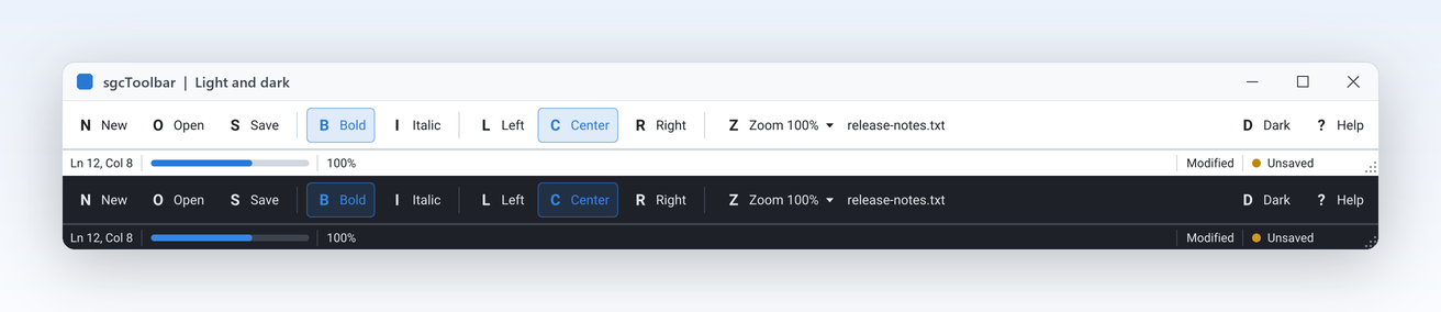
The bars take their colours from the sgcUICore theme tokens, the same ones every product of the suite uses, so a toolbar above an sgcGrid and beside an sgcNavigation bar looks like one application. Theme selects utLight or utDark, and AccentColor replaces the accent used by the focus ring, the down tint of toggles and the progress bars. Hot, pressed, down, focused and disabled states are all derived for you. Each bar has its own Theme, so set it on the toolbar and on the status bar. Switching at run time repaints both bars at once.

  • Theme: utDefault (default, follows the application theme), utLight or utDark
  • AccentColor as $AARRGGBB, 0 keeps the theme accent
  • Indicator colours follow the theme
  • Switch at run time for a dark mode toggle
Read the help topic

Look, keyboard and output

Keyboard access and a working size grip

The toolbar can join the tab order when your users need it: set TabStop and the focused button shows a focus ring, Left and Right move between enabled buttons, Home and End jump, Enter or Space activates. It is off by default, so the toolbar never steals focus from the editor below it. ClickItem activates an item from code, for example from a form shortcut. On the status bar, SizeGrip draws grip dots, and on VCL dragging them resizes a sizeable form. On FireMonkey the grip is drawn but does not resize the form, so set SizeGrip off there when the form is not sizeable.

  • TabStop on VCL, CanFocus on FireMonkey
  • ClickItem runs an item from code
  • SizeGrip and GripRect on the status bar
  • The grip resizes the form only when it is sizeable
Read the help topic

Look, keyboard and output

Render both bars without a window

Screenshots of a toolbar in a manual go out of date with every release. The renderer in sgcToolbar_Render paints a TsgcToolbarModel or a TsgcStatusBarModel with no window and no VCL or FireMonkey, so a console program, a test or a web server can produce the same bars as an image. SaveToPNG and SaveToSVG take a size in logical pixels and a scale, so 560 by 44 at scale 2 gives a sharp 1120 by 88 picture. The units build on every platform, Linux64 included. Pass your own images through OnGetImage and the picture matches the running application.

  • SaveToPNG writes a PNG file or stream
  • SaveToSVG writes the same bar as SVG
  • Works on TsgcToolbarModel and TsgcStatusBarModel
  • OnGetImage supplies icons to the headless output
Read the help topic

See sgcToolbar in action

sgcToolbar inside the sgcUI suite demos: complete applications that run offline with built-in simulated data.

Who Builds with sgcToolbar

Document and code editors

An editor needs Bold and Italic toggles, an alignment radio group, a Zoom menu, and a status bar with the line, the column and the save state. sgcToolbar covers all of it with one item collection and one panel collection, linked to the TActionList you already have. When the window narrows, the overflow menu keeps every command reachable. The EditorShell demo builds exactly this around a TMemo.

  • Item kinds
  • Radio groups
  • Overflow menu
Run the EditorShell demo

Long running tools and live feeds

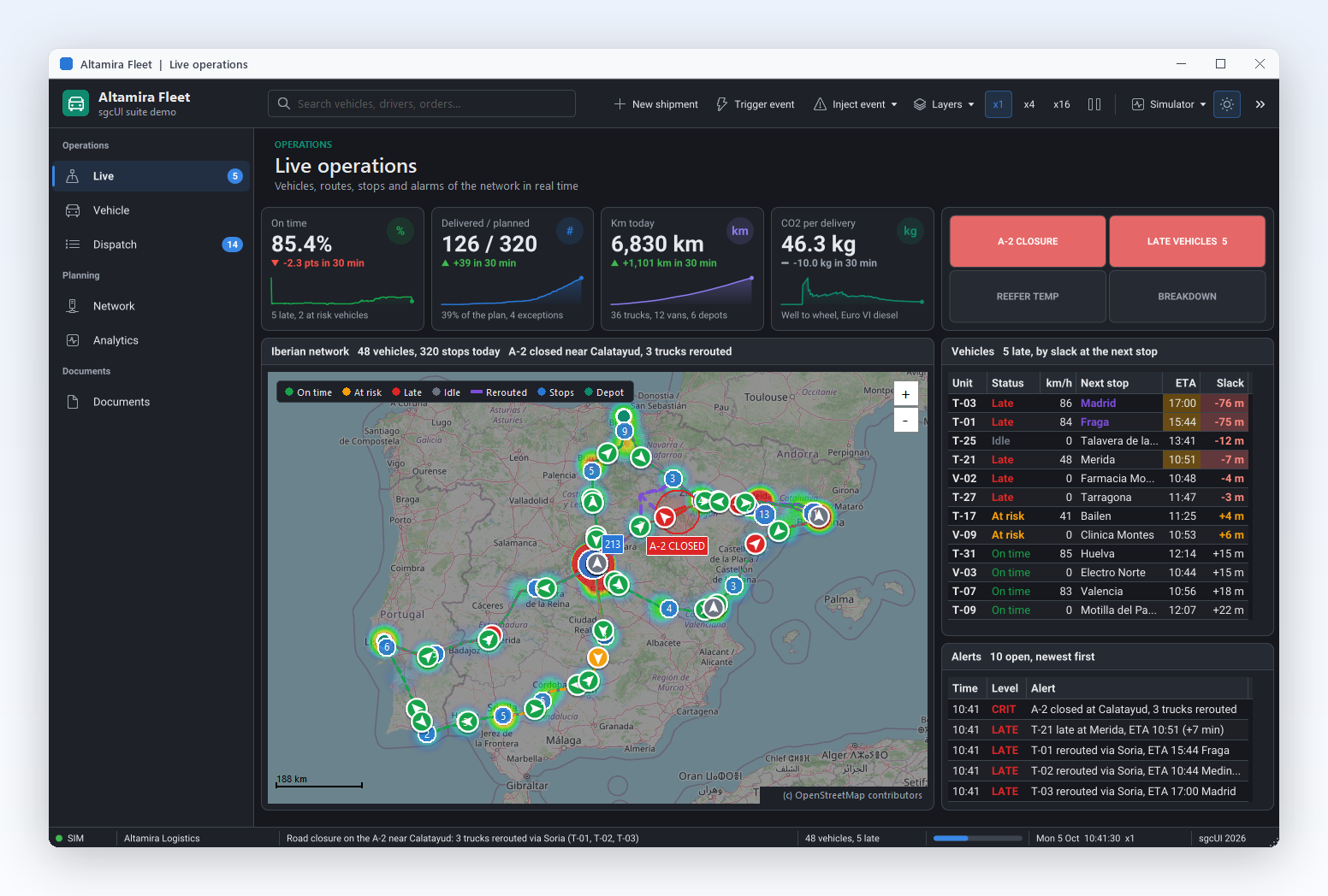
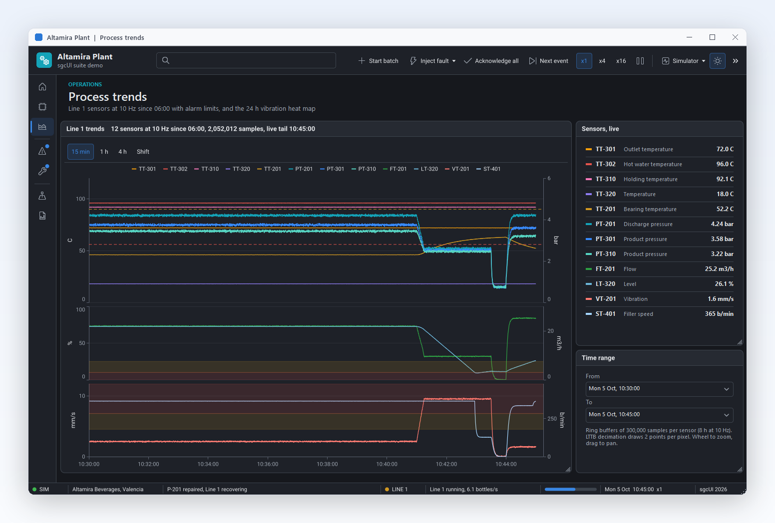
Import tools, sync clients and monitoring apps do their work in background threads and must report it. Call SetProgress, SetIndicator and SetPanelText straight from the worker thread, and the status bar repaints on the main thread with no Synchronize in your code. The indicator turns green, amber or red with the state of the job. The LiveStatus demo simulates a download that does exactly this.

  • Thread safe updates
  • Progress panels
  • Indicators
Run the LiveStatus demo

One command bar on every platform

A FireMonkey application that ships on Windows, macOS and mobile deserves the same toolbar everywhere. TsgcFMXToolbar and TsgcFMXStatusBar have the same items, panels and events as the VCL bars, and the .NET bars for WinForms, WPF and Avalonia follow the same names. EditorShellFMX is the FireMonkey version of the editor shell, with the same items, overflow menu and status panels.

  • FireMonkey bars
  • Themes
  • Status panels
Run the EditorShellFMX demo

A Toolbar and Status Bar in a Few Lines

The same API in Delphi, C++ Builder and C#: a toggle, a radio group, a dropdown, and a status bar updated from the click handler.

procedure TMainForm.CreateBars;
var
  oItem: TsgcToolbarItem;
  oPanel: TsgcStatusBarPanel;
begin
  // a toolbar with a toggle, a Left/Center radio group and a dropdown
  FToolbar := TsgcVCLToolbar.Create(Self);
  FToolbar.Parent := Self;
  FToolbar.ShowCaptions := True;
  FToolbar.ShowHint := True;
  FToolbar.OnItemClick := ToolbarItemClick;
  oItem := FToolbar.Items.Add;
  oItem.Caption := 'Save';
  oItem.Glyph := 'S';
  oItem.Hint := 'Save the document';
  FToolbar.Items.Add.Kind := tikSeparator;
  oItem := FToolbar.Items.Add;
  oItem.Kind := tikToggle;
  oItem.Caption := 'Bold';
  oItem.Glyph := 'B';
  oItem := FToolbar.Items.Add;
  oItem.Kind := tikToggle;
  oItem.GroupIndex := 1;
  oItem.Down := True;
  oItem.Caption := 'Left';
  oItem := FToolbar.Items.Add;
  oItem.Kind := tikToggle;
  oItem.GroupIndex := 1;
  oItem.Caption := 'Center';
  oItem := FToolbar.Items.Add;
  oItem.Kind := tikDropdown;
  oItem.Caption := 'Zoom';
  oItem.DropdownMenu := FZoomMenu;
  // a status bar: a spring text panel, a progress bar and an indicator
  FStatusBar := TsgcVCLStatusBar.Create(Self);
  FStatusBar.Parent := Self;
  oPanel := FStatusBar.Panels.Add;
  oPanel.Spring := True;
  oPanel.Text := 'Ready';
  FStatusBar.Panels.Add.Kind := spkProgress;
  oPanel := FStatusBar.Panels.Add;
  oPanel.Kind := spkIndicator;
  oPanel.AutoSize := True;
  oPanel.Text := 'Saved';
  oPanel.IndicatorState := sisOk;
end;

procedure TMainForm.ToolbarItemClick(Sender: TObject; aItem: TsgcToolbarItem);
begin
  // the setters are thread safe, a worker thread can call them directly
  FStatusBar.SetPanelText(0, aItem.Caption + ' clicked');
  FStatusBar.SetProgress(1, 60);
  FStatusBar.SetIndicator(2, sisWarning);
end;
#include <vcl.h>
#include <Vcl.Menus.hpp>
#include "sgcUICore_Theme.hpp"
#include "sgcToolbar_Model.hpp"
#include "sgcToolbar_VCL.hpp"

class TBarHandler : public TObject
{
public:
  TsgcVCLStatusBar *StatusBar;
  void __fastcall ItemClick(TObject *Sender, TsgcToolbarItem *aItem);
};

void __fastcall TBarHandler::ItemClick(TObject *Sender, TsgcToolbarItem *aItem)
{
  // the setters are thread safe, a worker thread can call them directly
  StatusBar->SetPanelText(0, aItem->Caption + " clicked");
  StatusBar->SetProgress(1, 60);
  StatusBar->SetIndicator(2, sisWarning);
}

void __fastcall CreateBars(TForm *Form, TBarHandler *Handler, TPopupMenu *ZoomMenu)
{
  // a toolbar with a toggle, a Left/Center radio group and a dropdown
  TsgcVCLToolbar *Toolbar = new TsgcVCLToolbar(Form);
  Toolbar->Parent = Form;
  Toolbar->ShowCaptions = true;
  Toolbar->OnItemClick = Handler->ItemClick;
  TsgcToolbarItem *Item = Toolbar->Items->Add();
  Item->Caption = "Save";
  Item->Glyph = "S";
  Item->Hint = "Save the document";
  Toolbar->Items->Add()->Kind = tikSeparator;
  Item = Toolbar->Items->Add();
  Item->Kind = tikToggle;
  Item->Caption = "Bold";
  Item = Toolbar->Items->Add();
  Item->Kind = tikToggle;
  Item->GroupIndex = 1;
  Item->Down = true;
  Item->Caption = "Left";
  Item = Toolbar->Items->Add();
  Item->Kind = tikToggle;
  Item->GroupIndex = 1;
  Item->Caption = "Center";
  Item = Toolbar->Items->Add();
  Item->Kind = tikDropdown;
  Item->Caption = "Zoom";
  Item->DropdownMenu = ZoomMenu;
  // a status bar: a spring text panel, a progress bar and an indicator
  TsgcVCLStatusBar *StatusBar = new TsgcVCLStatusBar(Form);
  StatusBar->Parent = Form;
  TsgcStatusBarPanel *Panel = StatusBar->Panels->Add();
  Panel->Spring = true;
  Panel->Text = "Ready";
  StatusBar->Panels->Add()->Kind = spkProgress;
  Panel = StatusBar->Panels->Add();
  Panel->Kind = spkIndicator;
  Panel->AutoSize = true;
  Panel->Text = "Saved";
  Panel->IndicatorState = sisOk;
  Handler->StatusBar = StatusBar;
}
using System;
using System.Windows.Forms;
using esegece.sgcToolbar;

internal class MainForm : Form
{
    private readonly TsgcWinFormsToolbar Toolbar = new TsgcWinFormsToolbar();
    private readonly TsgcWinFormsStatusBar StatusBar = new TsgcWinFormsStatusBar();

    public MainForm()
    {
        // a toolbar with a toggle, a Left/Center radio group and a dropdown
        Toolbar.ShowCaptions = true;
        Toolbar.OnItemClick = ToolbarItemClick;
        TsgcToolbarItem oItem = Toolbar.Items.Add();
        oItem.Caption = "Save";
        oItem.Glyph = "S";
        oItem.Hint = "Save the document";
        Toolbar.Items.Add().Kind = TsgcToolbarItemKind.tikSeparator;
        oItem = Toolbar.Items.Add();
        oItem.Kind = TsgcToolbarItemKind.tikToggle;
        oItem.Caption = "Bold";
        oItem = Toolbar.Items.Add();
        oItem.Kind = TsgcToolbarItemKind.tikToggle;
        oItem.GroupIndex = 1;
        oItem.Down = true;
        oItem.Caption = "Left";
        oItem = Toolbar.Items.Add();
        oItem.Kind = TsgcToolbarItemKind.tikToggle;
        oItem.GroupIndex = 1;
        oItem.Caption = "Center";
        ContextMenuStrip oZoom = new ContextMenuStrip();
        oZoom.Items.Add("100%");
        oZoom.Items.Add("200%");
        oItem = Toolbar.Items.Add();
        oItem.Kind = TsgcToolbarItemKind.tikDropdown;
        oItem.Caption = "Zoom";
        oItem.DropdownMenu = oZoom;
        // a status bar: a spring text panel, a progress bar and an indicator
        TsgcStatusBarPanel oPanel = StatusBar.Panels.Add();
        oPanel.Spring = true;
        oPanel.Text = "Ready";
        StatusBar.Panels.Add().Kind = TsgcStatusPanelKind.spkProgress;
        oPanel = StatusBar.Panels.Add();
        oPanel.Kind = TsgcStatusPanelKind.spkIndicator;
        oPanel.AutoSize = true;
        oPanel.Text = "Saved";
        oPanel.IndicatorState = TsgcStatusIndicatorState.sisOk;
        Controls.Add(Toolbar);
        Controls.Add(StatusBar);
    }

    private void ToolbarItemClick(object sender, TsgcToolbarItem aItem)
    {
        // the setters are thread safe, a worker thread can call them directly
        StatusBar.SetPanelText(0, aItem.Caption + " clicked");
        StatusBar.SetProgress(1, 60);
        StatusBar.SetIndicator(2, TsgcStatusIndicatorState.sisWarning);
    }
}
dotnet add package esegece.sgcToolbar.WinForms

Run the sgcToolbar Demos

The EditorShell and LiveStatus demos ship for VCL and C++ Builder, plus a FireMonkey version for Delphi, and in the .NET edition as WinForms, WPF and Avalonia projects.

EditorShell

Registered only EditorShell

A TMemo editor shell with toggles, a Left, Center and Right radio group, a Zoom dropdown, TActionList links, the overflow menu, line and column panels and a Dark toggle. It uses overflow and actions, so it needs the Registered or Trial edition.

LiveStatus

A worker thread simulates a download and feeds a text panel, a progress panel and an indicator that turns green, amber or red, with Start and Stop buttons. It builds with the Community edition.

Registered only EditorShellFMX

The EditorShell demo with a TsgcFMXToolbar and a TsgcFMXStatusBar around a FireMonkey TMemo, for Delphi only: the same items, action links, overflow menu and status panels.

Compiled demos

Ready to run executables of every sgcUI product, nothing to install.

Download sgcUI_bin.zip →

Where sgcToolbar Is Included

sgcToolbar is in every sgcUI edition, starting with Standard, and it is also sold on its own. sgcToolbar is also included in the All-Access bundle.

sgcToolbar single package

€149 / developer, full source code, 1 year of updates.

Buy sgcToolbar → See pricing →

sgcUI Standard

sgcToolbar, sgcGrid, sgcNavigation and sgcEditors, from €380.

See Standard →

sgcUI Professional

Standard plus sgcCharts, sgcDashboard and sgcGauges, from €529.

See Professional →

sgcUI Enterprise

All 14 sgcUI products, from €699.

See Enterprise →

The free Community edition (esegece.sgcToolbar.Community on NuGet) leaves out the overflow menu and the Action links.

FeatureCommunity (free)Registered
Every item kind, toggles, radio groups and dropdown menus✓✓
Text, progress and indicator panels✓✓
Thread safe status updates✓✓
Icons, glyphs, themes, keyboard and size grip✓✓
Headless PNG and SVG output✓✓
Overflow menu−✓
Action links (Delphi) and Command (.NET)−✓

Supported Frameworks and Platforms

Components in sgcToolbar

ComponentTarget
TsgcVCLToolbar, TsgcVCLStatusBarDelphi and C++ Builder, VCL (sgcToolbar_VCL)
TsgcFMXToolbar, TsgcFMXStatusBarDelphi and C++ Builder, FireMonkey (sgcToolbar_FMX)
TsgcToolbarItem, TsgcStatusBarPanel, TsgcToolbarModel, TsgcStatusBarModelFramework neutral models (sgcToolbar_Model)
TsgcWinFormsToolbar, TsgcWinFormsStatusBar.NET, WinForms
TsgcWpfToolbar, TsgcWpfStatusBar.NET, WPF
TsgcAvaloniaToolbar, TsgcAvaloniaStatusBar.NET, Avalonia
TargetComponentPlatforms
Delphi 7 to 13, VCLTsgcVCLToolbar, TsgcVCLStatusBarWin32 and Win64
Delphi XE6 to 13, FireMonkeyTsgcFMXToolbar, TsgcFMXStatusBarWindows, macOS, iOS, Android and Linux (FMXLinux)
C++ Builder 2007 to 13VCL and FireMonkey barsGenerated .hpp headers and static libraries
Delphi 10.2 to 13, framework neutralModels and headless PNG and SVG rendererLinux64, for example to render a toolbar on a server
.NET Framework 4.7.2, .NET 8, 9 and 10TsgcWinFormsToolbar, WPF and Avalonia barsWinForms, WPF and Avalonia

Frequently Asked Questions

Yes. SetPanelText, SetProgress and SetIndicator may be called from any thread with no Synchronize or Queue. The model guards the values with a lock and the bar repaints on the main thread. Every other property is set from the main thread. See Thread-safe updates.

It covers the same jobs: buttons, toggles, dropdown buttons, separators and labels on top, text panels at the bottom. It adds a spacer item, progress and indicator panels, thread safe setters, themes and headless output. Your existing TActionList and TPopupMenu components plug in through Action and DropdownMenu.

The overflow menu and the Action links of the items, which are Command and CommandParameter in .NET. In Community the items that do not fit are clipped. Every other feature, including the thread safe status updates, the progress and indicator panels and the headless output, is in Community.

Yes. C++ Builder 2007 to 13 use the same VCL and FireMonkey bars through generated headers and libraries, and the EditorShell and LiveStatus demos ship as C++ Builder projects too. The code tab on this page shows the same toolbar in Delphi, C++ Builder and C#.

Yes. All sizes are logical pixels multiplied by the scale of the monitor, and the icon slot is 16 logical pixels, so buttons, glyphs, progress bars and indicator dots stay sharp at any DPI. FireMonkey takes images from the image list at the device size of the frame.

Yes. SaveToSVG and SaveToPNG of TsgcToolbarModel and TsgcStatusBarModel draw the bars without a window, also on Linux64 from Delphi 10.2, so a build step can regenerate the pictures of your manual for every release. A scale parameter gives sharp images for high DPI screens and print.

sgcToolbar Help

3,000+Developers
20+Years
761+Components
30+API Integrations
5Platforms
30-Day Money-Back GuaranteeNot satisfied? Request a full refund within 30 days of purchase. See refund policy

Try sgcToolbar Today

The sgcUI trial includes sgcToolbar and every other sgcUI product.