Delphi, C++ Builder & .NET Part of sgcUI

sgcNavigation, the Sidebar and Accordion Navigation Bar for Delphi, C++ Builder & .NET

Give your application a modern navigation menu in minutes. One control is a sidebar or an accordion, folds into an icon rail with a smooth animation, shows badges for unread counts and works fully from the keyboard. Light and dark themes come built in.

VCL, FireMonkey, WinForms, WPF, AvaloniaDelphi 7 to 13 and C++ Builder 2007 to 13Free .NET Community editionIncluded in sgcUI Standard
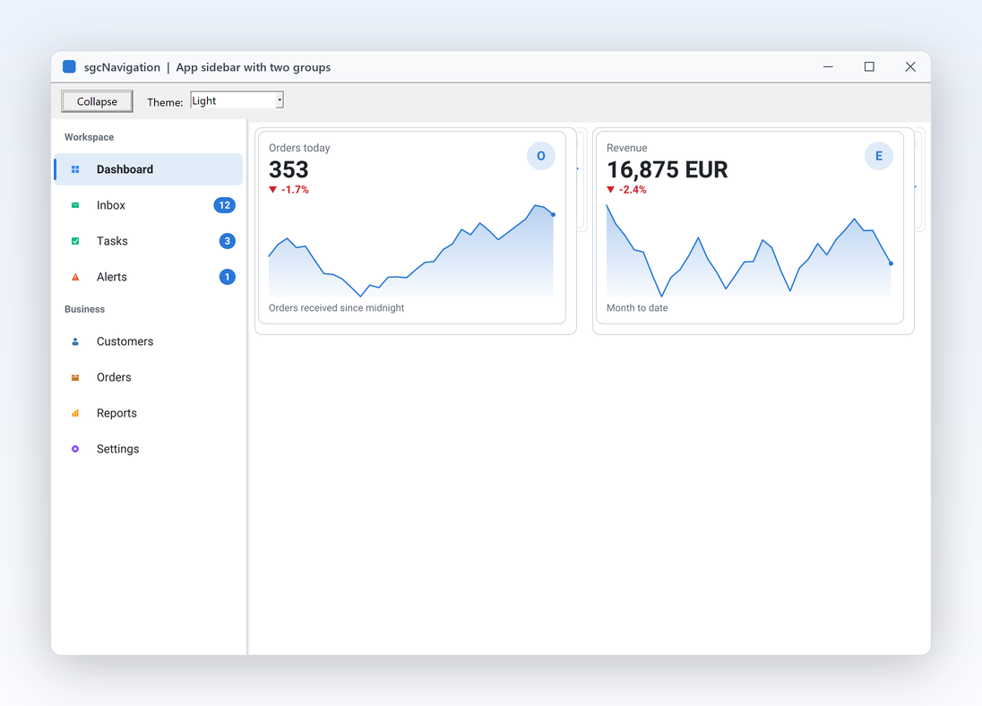
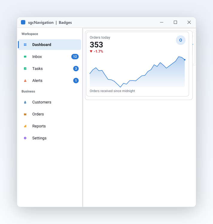
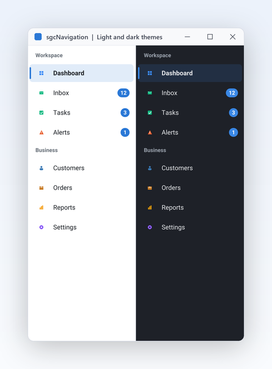
SidebarApp demo with a sidebar of 8 items in the Workspace and Business groups, Dashboard selected and two KPI cards on the right

Everything an App Menu Needs

Ten features that turn a list of pages into a navigation shell your users find their way around at once.

Layout and modes

One control covers the two navigation styles business applications use, and the narrow rail between them.

A modern app sidebar in one component

Layout and modes

A modern app sidebar in one component

Most business applications need the same thing on the left edge of the main form: a list of pages, grouped by area, with the current page clearly marked. Drop a TsgcVCLNavigationBar on the form, align it to the left and add the items. Group headers title the rows below them in a muted colour and are never selected. The selected row gets an accent tinted background and a 3 pixel accent bar, so users always see where they are. Hover and pressed states, hints and disabled rows are all drawn for you, so the bar feels finished on the first run.

  • Mode := nbmSidebar is the default style
  • IsGroup turns an item into a group header
  • ItemHeight and GroupHeight set the row heights
  • The mouse wheel scrolls long lists and ScrollIntoView shows any item
  • Right to left for Arabic and Hebrew: icons and captions swap places, and the indent, chevrons, badges and collapse button are mirrored
Read the help topic
Switch to an accordion with one property

Layout and modes

Switch to an accordion with one property

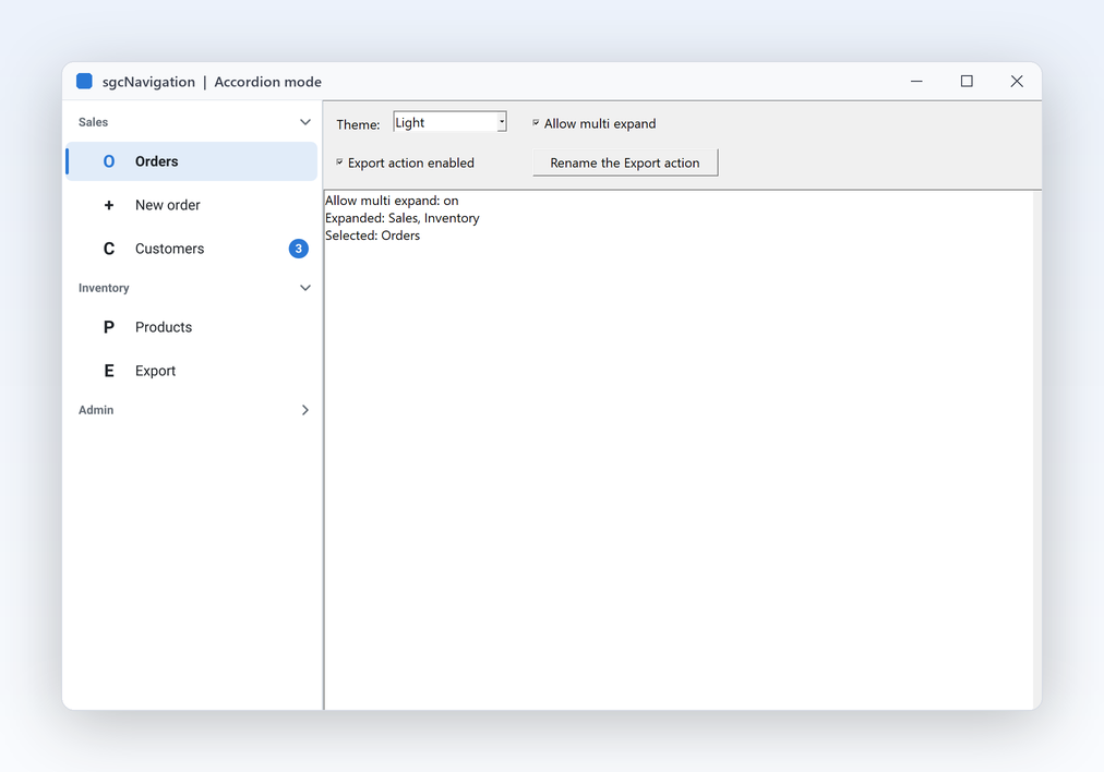
Settings screens and admin consoles often have more sections than fit on screen. Set Mode to nbmAccordion and every group header becomes a section that opens and closes the items below it, with a chevron on the right and indented children. By default only one group is open at a time, which keeps a long menu short. Set AllowMultiExpand when users need several sections open together. The items, the events and your code stay exactly the same. Items placed before the first header belong to no group and are always shown, which suits a Home or Dashboard entry above the sections.

  • Mode := nbmAccordion switches the whole bar
  • Expanded opens or closes a group from code
  • AllowMultiExpand lets several groups stay open
  • Indent sets the indentation of the child items
Read the help topic

Layout and modes

Collapse to an icon rail, animated

Wide sidebars steal space from the data your users came to see. Set Collapsed and the bar folds from its expanded width to a narrow icon rail in about 150 ms. In the rail only the icons are drawn, the caption becomes the hint, group headers turn into separator lines and badges become dots, so nothing important is lost. The bar sets its own width, so the content beside it simply follows with alClient. Bind the Collapsed property to a hamburger button, a user setting or the width of the form, and the rail opens and closes the same way in sidebar and in accordion mode.

  • Collapsed switches between the two widths
  • ExpandedWidth (220) and CollapsedWidth (56) in logical pixels
  • AnimateCollapse turns the animation on or off
  • OnCollapsedChange tells you when the rail opens or closes
Read the help topic

Layout and modes

Drive your pages from the selection

A navigation bar is only useful when it switches what the user sees. Click or tap an enabled item and the bar selects it, fires OnItemClick and then runs the OnClick of the item. OnSelectionChange is the single place to show the matching page, for example the tab of a TPageControl with hidden tabs, which is exactly how the SidebarApp demo is built. SelectedIndex reads and sets the current page from code. Disable an item the user cannot reach yet, explain why in its hint, or hide it for roles that should not see it, and the selection logic keeps working.

  • SelectedIndex is the page the user chose
  • OnSelectionChange switches the page or frame
  • OnItemClick on the bar and OnClick per item
  • Enabled, Hint and Visible per item
Read the help topic

Items that inform

Rows carry more than a caption: an icon, a count and a link to the logic you already wrote.

Badges for unread counts

Items that inform

Badges for unread counts

Users should see that something needs attention before they open the page. Give an item a Badge, such as an unread count or the word New, and the bar draws it as a pill in the accent colour at the right of the row, with black or white text, whichever reads better. Set it from code whenever the value changes and the bar repaints itself. In the collapsed rail the badge becomes a dot on the icon. Because the badge is plain text, the same property covers counts, short labels and status words without any custom drawing code.

  • Badge is a short text per item
  • An empty Badge draws nothing
  • The pill uses the theme accent or your AccentColor
  • Combine with Hint to explain the count
Read the help topic
Icons from your image list or a glyph

Items that inform

Icons from your image list or a glyph

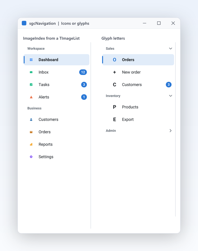
Every row has an icon slot. Point the bar at the image list you already use and set ImageIndex per item, and masked or 32 bit images are converted once and cached until the list changes. No image list yet? Set a Glyph instead, a letter or short symbol that follows the theme colours, which is how the demos look. A disabled item paints its image at 40 percent opacity, so state is clear at a glance. Mixing both is fine: items with an image index show the image and the others fall back to their glyph, so you can add icons gradually.

  • Images and ImageIndex for image lists
  • Glyph for a letter or symbol with no images
  • VCL draws the images at their own size
  • FireMonkey image lists from Delphi XE8
Read the help topic

Items that inform Registered only

Wire items to your TActions

Applications built on a TActionList already hold their commands, captions and enabled rules in one place. Link an item to any VCL or FireMonkey TAction through its Action property and its Caption, Enabled, Visible, Hint and ImageIndex follow the action. A click executes the action with the bar as its ActionComponent, and OnUpdate runs on idle, so an item greys out as soon as its action is disabled. In .NET the same job is done by Command and CommandParameter. One TActionList can drive the menu, the toolbar and the keyboard shortcuts of the form.

  • Action links an item to any TBasicAction
  • An item OnClick runs instead of the action
  • Compiled under SGC_NAVIGATION_ACTIONS
  • .NET: Command and CommandParameter with ICommand

Community: assign the item OnClick or the bar OnItemClick instead of an action.

Read the help topic

Keyboard, themes and output

The details that make the bar feel native and keep it consistent with the rest of your application.

Keyboard first navigation

Keyboard, themes and output

Keyboard first navigation

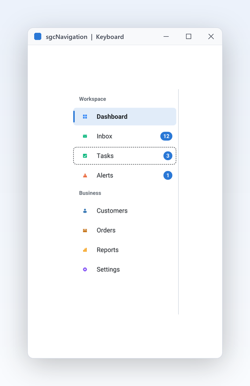
Power users switch pages without the mouse, and accessibility reviews expect it. The bar takes the focus with Tab and moves a focused row over the visible, enabled items: Up and Down step, Home and End jump, Enter or Space activates. In the accordion Left collapses a group and Right expands it. The dashed focus rectangle only appears while the keyboard is in use, and focus stays separate from the selected page. The same keys work in the FireMonkey bar through CanFocus, so desktop users get the same behaviour on every platform.

  • TabStop is on by default for the VCL bar
  • FocusedIndex of the model is the keyboard row
  • SelectedIndex stays the chosen page
  • Hints show the caption in the collapsed rail
Read the help topic
Light, dark and your accent colour

Keyboard, themes and output

Light, dark and your accent colour

A menu that ignores the theme of the application looks bolted on. Theme sets the surface, border, text, group header, hover and accent colours from the shared sgcUICore tokens, so a bar and an sgcDashboard with the same Theme match exactly. AccentColor replaces the accent with your brand colour for the selection bar, the focus rectangle and the badges. A bar hosted in a dashboard tile follows the theme of the dashboard on its own. Switch the theme at run time and the bar repaints at once, ready for a dark mode toggle in your settings page.

  • Theme: utDefault (default, follows the application theme), utLight or utDark
  • AccentColor as a $AARRGGBB value, 0 keeps the theme accent
  • Same tokens as every sgcUI product
  • Dashboard tiles push their theme into the bar
Read the help topic
Render the bar without a window

Keyboard, themes and output

Render the bar without a window

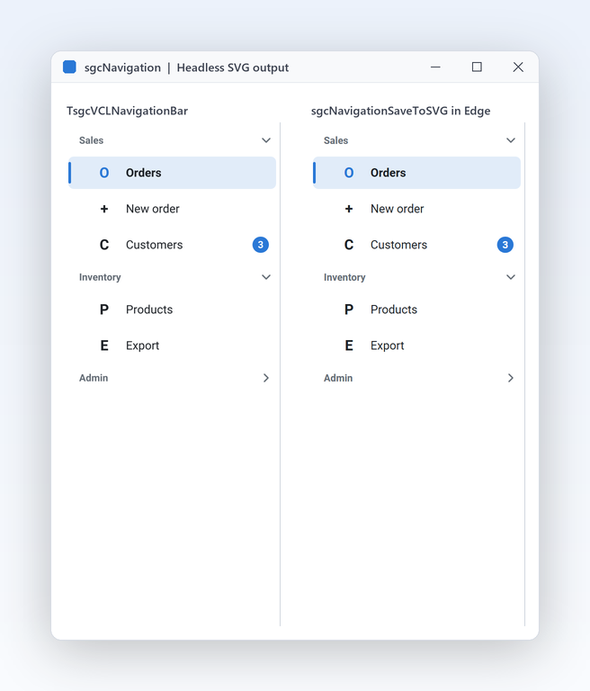
Documentation, visual tests and web back ends sometimes need a picture of the menu, not the menu itself. The renderer in sgcNavigation_Render paints a TsgcNavigationModel with no window and no VCL or FireMonkey, so a console program, a service or a server produces the same bar as a PNG or SVG. The unit builds on every platform, Linux64 included, and a scale parameter gives sharp images for high DPI screens. Pass your image list to the renderer and the exported picture shows the same icons as the running application.

  • sgcNavigationSaveToPNG writes a PNG file or stream
  • sgcNavigationSaveToSVG writes the same bar as SVG
  • sgcNavigationRender paints on any sgcUICore canvas
  • Width and height in logical pixels, times the scale
Read the help topic

See sgcNavigation in action

sgcNavigation inside the sgcUI suite demos: complete applications that run offline with built-in simulated data.

Who Builds with sgcNavigation

A modern shell for ERP and admin apps

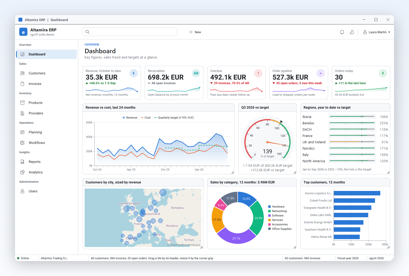
You have dozens of existing forms and a main window that still opens them from a menu bar. Put a sidebar on the left, one item per area, and let OnSelectionChange switch the tabs of a TPageControl with hidden tabs. Badges show pending orders or unread messages, and the icon rail gives the forms their space back. Run SidebarApp to see the pattern working with an sgcDashboard page.

  • Sidebar mode
  • Badges
  • Collapse to an icon rail
Run the SidebarApp demo

Settings and admin consoles

Configuration screens group dozens of pages under a few headings such as Sales, Inventory and Admin. The accordion keeps one section open at a time, or several with AllowMultiExpand, and the Action links reuse the commands and enabled rules of your TActionList. Keyboard users move through the sections with the arrow keys. The Accordion demo shows three groups, an expand toggle and a click log.

  • Accordion mode
  • Action links
  • Keyboard navigation
Run the Accordion demo

The same navigation on every platform

A FireMonkey application that runs on Windows, macOS, iOS and Android should not need a different menu on each. TsgcFMXNavigationBar has the same items, modes and events as the VCL bar, and the .NET bars for WinForms, WPF and Avalonia follow the same names. Teams that ship a Delphi desktop app and a .NET tool keep one mental model. SidebarFMX is the FireMonkey version of the sidebar demo.

  • FireMonkey bar
  • Themes
  • .NET bars
Run the SidebarFMX demo

A Navigation Bar in a Few Lines

The same API in Delphi, C++ Builder and C#: an accordion bar with groups, a badge, a disabled item and a Collapse button.

procedure TMainForm.CreateNavigation;
var
  oItem: TsgcNavigationItem;
begin
  // an accordion bar on the left, dark theme, several groups open at once
  FNav := TsgcVCLNavigationBar.Create(Self);
  FNav.Parent := Self;
  FNav.Align := alLeft;
  FNav.Mode := nbmAccordion;
  FNav.AllowMultiExpand := True;
  FNav.Theme := utDark;
  // a group header (third parameter True), then the items under it
  FNav.Items.AddItem('Sales', '', True);
  FNav.Items.AddItem('Orders', 'O');
  FNav.Items.AddItem('Invoices', 'I').Badge := '3';
  FNav.Items.AddItem('Admin', '', True);
  oItem := FNav.Items.AddItem('Users', 'U');
  oItem.Hint := 'Manage the users';
  oItem := FNav.Items.AddItem('Billing', 'B');
  oItem.Enabled := False;
  FNav.SelectedIndex := 1;
  FNav.OnItemClick := NavItemClick;
  FNav.OnSelectionChange := NavSelectionChange;
  // a Collapse button folds the bar into an icon rail with an animation
  FNav.AnimateCollapse := True;
  FButton.Caption := 'Collapse';
  FButton.OnClick := ButtonClick;
end;

procedure TMainForm.NavItemClick(Sender: TObject; aItem: TsgcNavigationItem);
begin
  Caption := 'Clicked: ' + aItem.Caption;
end;

procedure TMainForm.NavSelectionChange(Sender: TObject);
begin
  FPanel.Caption := FNav.Items[FNav.SelectedIndex].Caption + ' page';
end;

procedure TMainForm.ButtonClick(Sender: TObject);
begin
  FNav.Collapsed := not FNav.Collapsed;
end;
#include <vcl.h>
#include <Vcl.ExtCtrls.hpp>
#include "sgcUICore_Theme.hpp"
#include "sgcNavigation_Model.hpp"
#include "sgcNavigation_VCL.hpp"

class TNavHandler : public TObject
{
public:
  TsgcVCLNavigationBar *Nav;
  TPanel *Content;
  void __fastcall ItemClick(TObject *Sender, TsgcNavigationItem *aItem);
  void __fastcall SelectionChange(TObject *Sender);
  void __fastcall CollapseClick(TObject *Sender);
};

void __fastcall TNavHandler::ItemClick(TObject *Sender, TsgcNavigationItem *aItem)
{
  Content->Caption = "Clicked: " + aItem->Caption;
}

void __fastcall TNavHandler::SelectionChange(TObject *Sender)
{
  Content->Caption = Nav->Items->Items[Nav->SelectedIndex]->Caption + " page";
}

void __fastcall TNavHandler::CollapseClick(TObject *Sender)
{
  Nav->Collapsed = !Nav->Collapsed;   // animated fold into an icon rail
}

void __fastcall CreateNavigation(TForm *Form, TNavHandler *Handler)
{
  // an accordion bar on the left, dark theme, several groups open at once
  TsgcVCLNavigationBar *Nav = new TsgcVCLNavigationBar(Form);
  Nav->Parent = Form;
  Nav->Align = alLeft;
  Nav->Mode = nbmAccordion;
  Nav->AllowMultiExpand = true;
  Nav->AnimateCollapse = true;
  Nav->Theme = utDark;
  // a group header (third parameter true), then the items under it
  Nav->Items->AddItem("Sales", "", true);
  Nav->Items->AddItem("Orders", "O", false);
  Nav->Items->AddItem("Invoices", "I", false)->Badge = "3";
  Nav->Items->AddItem("Admin", "", true);
  Nav->Items->AddItem("Users", "U", false)->Hint = "Manage the users";
  Nav->Items->AddItem("Billing", "B", false)->Enabled = false;
  Nav->SelectedIndex = 1;
  TPanel *Content = new TPanel(Form);
  Content->Parent = Form;
  Content->Align = alClient;
  Handler->Nav = Nav;
  Handler->Content = Content;
  Nav->OnItemClick = Handler->ItemClick;
  Nav->OnSelectionChange = Handler->SelectionChange;
  TButton *Button = new TButton(Form);
  Button->Parent = Content;
  Button->Caption = "Collapse";
  Button->OnClick = Handler->CollapseClick;
}
using System;
using System.Windows.Forms;
using esegece.sgcUICore;
using esegece.sgcNavigation;

internal class MainForm : Form
{
    private readonly TsgcWinFormsNavigationBar Nav = new TsgcWinFormsNavigationBar();
    private readonly Label lblPage = new Label { Dock = DockStyle.Fill };
    private readonly Button btnCollapse = new Button { Text = "Collapse", Dock = DockStyle.Top };

    public MainForm()
    {
        // an accordion bar on the left, dark theme, several groups open at once
        Nav.Dock = DockStyle.Left;
        Nav.Mode = TsgcNavigationMode.nbmAccordion;
        Nav.AllowMultiExpand = true;
        Nav.AnimateCollapse = true;
        Nav.Theme = TsgcUITheme.utDark;
        // a group header (third parameter true), then the items under it
        Nav.Items.AddItem("Sales", "", true);
        Nav.Items.AddItem("Orders", "O");
        Nav.Items.AddItem("Invoices", "I").Badge = "3";
        Nav.Items.AddItem("Admin", "", true);
        Nav.Items.AddItem("Users", "U").Hint = "Manage the users";
        Nav.Items.AddItem("Billing", "B").Enabled = false;
        Nav.SelectedIndex = 1;
        Nav.OnItemClick = (sender, item) => Text = "Clicked: " + item.Caption;
        Nav.OnSelectionChange = sender => lblPage.Text = Nav.Items[Nav.SelectedIndex].Caption + " page";
        // the Collapse button folds the bar into an icon rail with an animation
        btnCollapse.Click += (s, e) => Nav.Collapsed = !Nav.Collapsed;
        Controls.Add(lblPage);
        Controls.Add(btnCollapse);
        Controls.Add(Nav);
    }
}
dotnet add package esegece.sgcNavigation.WinForms

Run the sgcNavigation Demos

The SidebarApp and Accordion demos ship for VCL and C++ Builder, plus a FireMonkey version for Delphi, and in the .NET edition as WinForms, WPF and Avalonia projects.

SidebarApp

SidebarApp

A sidebar that drives a page control with hidden tabs, with icons, a badge, a disabled item, a Collapse button, a theme combo and an sgcDashboard KPI page. Proves the application shell pattern end to end.

Accordion

Registered only Accordion

Three groups, Sales, Inventory and Admin, an AllowMultiExpand toggle, Action links and a click log. It uses Action links, so it needs the Registered or Trial edition.

SidebarFMX

The sidebar demo built with TsgcFMXNavigationBar for FireMonkey, for Delphi only. The same items, modes and events as the VCL version, ready for Windows, macOS and mobile targets.

Compiled demos

Ready to run executables of every sgcUI product, nothing to install.

Download sgcUI_bin.zip →

Where sgcNavigation Is Included

sgcNavigation is in every sgcUI edition, starting with Standard, and it is also sold on its own. sgcNavigation is also included in the All-Access bundle.

sgcNavigation single package

€149 / developer, full source code, 1 year of updates.

Buy sgcNavigation → See pricing →

sgcUI Standard

sgcNavigation, sgcGrid, sgcToolbar and sgcEditors, from €380.

See Standard →

sgcUI Professional

Standard plus sgcCharts, sgcDashboard and sgcGauges, from €529.

See Professional →

sgcUI Enterprise

All 14 sgcUI products, from €699.

See Enterprise →

The free Community edition (esegece.sgcNavigation.Community on NuGet) has everything except the Action links of the items.

FeatureCommunity (free)Registered
Sidebar and accordion modes✓✓
Collapse to an animated icon rail✓✓
Icons, glyphs and badges✓✓
Keyboard navigation✓✓
Light and dark themes, accent colour✓✓
Headless PNG and SVG output✓✓
Action links (Delphi) and Command (.NET)−✓

Supported Frameworks and Platforms

Components in sgcNavigation

ComponentTarget
TsgcVCLNavigationBarDelphi and C++ Builder, VCL (sgcNavigation_VCL)
TsgcFMXNavigationBarDelphi and C++ Builder, FireMonkey (sgcNavigation_FMX)
TsgcNavigationItem, TsgcNavigationItems, TsgcNavigationModelFramework neutral model (sgcNavigation_Model)
TsgcWinFormsNavigationBar.NET, WinForms
TsgcWpfNavigationBar.NET, WPF
TsgcAvaloniaNavigationBar.NET, Avalonia
TargetComponentPlatforms
Delphi 7 to 13, VCLTsgcVCLNavigationBarWin32 and Win64
Delphi XE6 to 13, FireMonkeyTsgcFMXNavigationBarWindows, macOS, iOS, Android and Linux (FMXLinux)
C++ Builder 2007 to 13TsgcVCLNavigationBar, TsgcFMXNavigationBarGenerated .hpp headers and static libraries
Delphi 10.2 to 13, framework neutralModel and headless PNG and SVG rendererLinux64, for example to render a bar on a server
.NET Framework 4.7.2, .NET 8, 9 and 10TsgcWinFormsNavigationBar, WPF and Avalonia barsWinForms, WPF and Avalonia

Frequently Asked Questions

Both. The Mode property switches between nbmSidebar and nbmAccordion on the same control, with the same items and events, so you can change your mind late in the project or offer both styles as a user preference. Each mode also folds into the collapsed icon rail.

Yes. Handle OnSelectionChange and show the page that matches SelectedIndex, for example the tab of a TPageControl with hidden tabs, or create a frame on demand. The SidebarApp demo is built exactly this way and hosts an sgcDashboard KPI page.

Yes. TsgcFMXNavigationBar targets Windows, macOS, iOS, Android and Linux (FMXLinux) from Delphi XE6, with the same items, modes and events as the VCL bar. FireMonkey image lists need Delphi XE8 or later; older versions use the Glyph of each item.

Only the Action links of the items, which in .NET are the Command and CommandParameter properties. Use the item OnClick or the bar OnItemClick instead. Every other feature, including the icon rail, badges, themes and headless output, is in Community. See Editions.

No. The .NET port has no designer verbs or collection editor, so items are not serialized and you add them in code, usually in the constructor of the form or window. In Delphi and C++ Builder the Items collection is edited at design time with the standard collection editor.

Yes. All sizes are logical pixels multiplied by the scale of the monitor, so the rows, icons and badges are sharp at any DPI. In WinForms the widths and heights scale with DPI / 96 as in VCL, and in WPF and Avalonia they are device independent units.

Yes. sgcNavigationSaveToPNG and sgcNavigationSaveToSVG render a bar from its model without a window and without VCL or FireMonkey, also on Linux64 from Delphi 10.2. Use it for documentation, visual regression tests or a web page that shows the menu of your application.

sgcNavigation Help

3,000+Developers
20+Years
761+Components
30+API Integrations
5Platforms
30-Day Money-Back GuaranteeNot satisfied? Request a full refund within 30 days of purchase. See refund policy

Try sgcNavigation Today

The sgcUI trial includes sgcNavigation and every other sgcUI product.