Delphi, C++ Builder & .NET Part of sgcUI

sgcEditors, the Modern Input Controls for Delphi, C++ Builder & .NET

Nine form inputs that look the same on every monitor and behave like native edits: a calendar with real booking rules, date and time pickers, a range slider, a colour picker, chips, stars and a spin edit. Type a date in your own language, switch to the dark theme with one property, and bind the editors to a dataset.

Nine controls for VCL, FireMonkey, WinForms, WPF, AvaloniaNative text entry with IME and clipboardFree .NET Community editionIncluded in sgcUI Standard
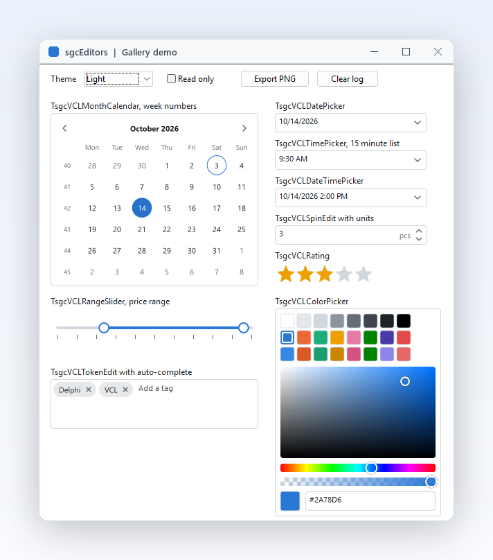
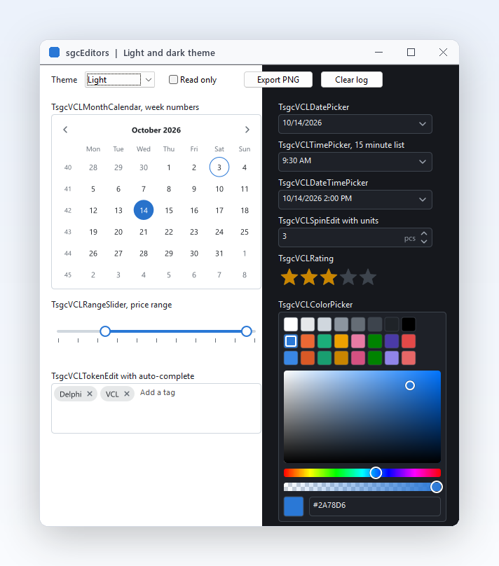
Gallery demo with the month calendar, date, time and date time pickers, spin edit, rating, range slider, token edit and colour picker

Inputs Your Forms Deserve

Eleven features that make dates, ranges, colours and tags quick to enter and hard to get wrong.

The controls

Nine inputs that cover the fields of real business forms, each one available for VCL, FireMonkey and .NET.

Nine modern inputs in one package

The controls

Nine modern inputs in one package

Booking forms, settings pages and filters keep asking for the same inputs: a calendar, a date or time picker, a slider, a colour, a list of tags, a star rating and a number with units. sgcEditors gives you all nine as one consistent family. Each control exists for VCL and FireMonkey with the same published properties and events, and for WinForms, WPF and Avalonia with the same names, so what you learn on one control applies to the others. They share one theme, one accent colour and one keyboard model. Drop them from the SGC Editors page of the palette and they look right on the first run.

  • TsgcVCLMonthCalendar, TsgcVCLDatePicker, TsgcVCLTimePicker, TsgcVCLDateTimePicker
  • TsgcVCLRangeSlider and TsgcVCLSpinEdit for numbers
  • TsgcVCLColorPicker, TsgcVCLTokenEdit, TsgcVCLRating
  • All descend from TsgcVCLCustomEditor
Read the help topic
A calendar that follows real booking rules

The controls

A calendar that follows real booking rules

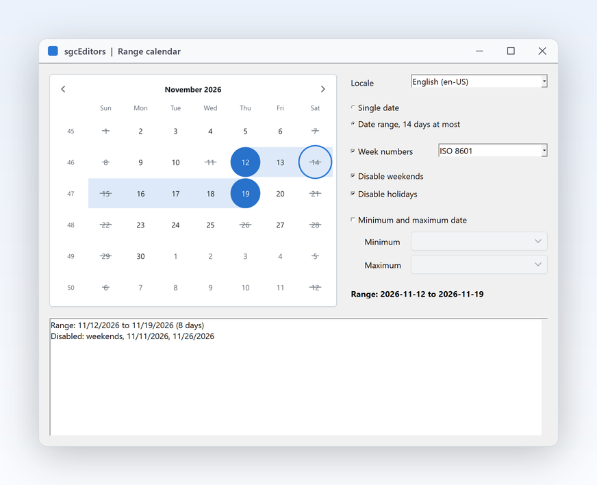
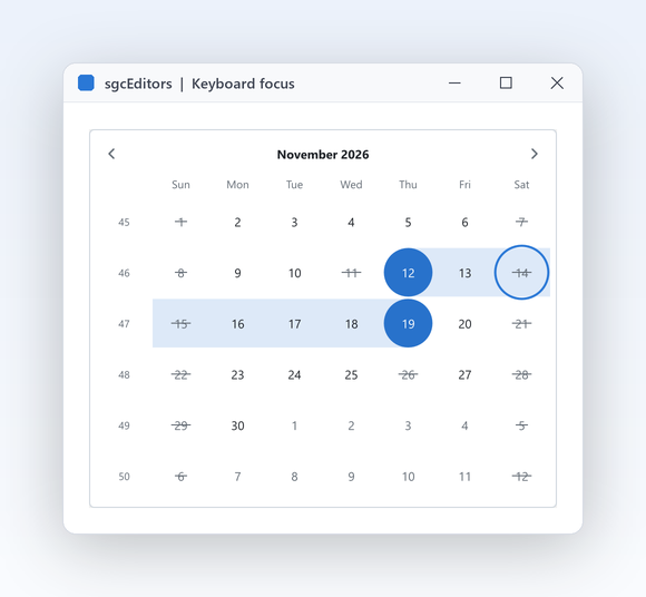
A hotel, a clinic or a rental desk never accepts just any date. The month calendar selects one date or, with SelectionMode set to esmRange, a range of days, and MaxRangeDays caps how long that range may be. Days outside MinDate and MaxDate, listed DisabledDates, DisabledWeekDays such as weekends, and any day your OnIsDateDisabled handler refuses are drawn struck through and cannot be picked. ISO 8601 week numbers and the month, year and decade views help users jump far ahead. The same calendar drives the drop down of the date pickers, so the rules apply everywhere a date is chosen.

  • SelectionMode: esmSingle or esmRange
  • MinDate, MaxDate and MaxRangeDays
  • DisabledDates, DisabledWeekDays, OnIsDateDisabled
  • ShowWeekNumbers for ISO week numbers
Read the help topic
Price and date ranges with two thumbs

The controls Registered only

Price and date ranges with two thumbs

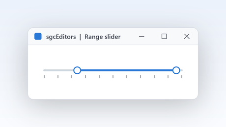
Filters for price, weight or distance read best as a range on a rail. The range slider picks a value between Min and Max with one thumb, or a range with two thumbs in RangeMode, horizontal or vertical. It draws ticks, labels and a tip with the value over the dragged thumb, and a click on the rail moves the nearest thumb there. The thumbs never cross, Step snaps the values and MinRange keeps a minimum gap, so the filter can never become empty by accident. Values and labels follow the locale of the control, including decimal and thousand separators.

  • RangeMode with Value and EndValue
  • Min, Max, Step and MinRange
  • TickInterval, ShowLabels, ShowValueTip
  • LabelFormat or OnFormatLabel for currencies

Community: one thumb is drawn and edited; EndValue is kept but not shown.

Read the help topic
Tags and chips with auto complete

The controls Registered only

Tags and chips with auto complete

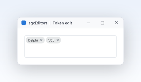
Tags, recipients and skills are lists, not one line of text. The token edit draws every entry as a chip with a remove button, wraps the chips and scrolls when they do not fit. A delimiter, Enter, Tab or the focus loss turns the typed text into a chip, and pasting a, b, c makes three. OnValidateToken normalises or refuses each entry, and AllowDuplicates, CaseSensitive and MaxTokens set the rules. In Registered builds an auto complete list suggests entries as the user types. AddToken, RemoveToken and Clear change the list from code when you load or save a record.

  • Tokens holds the chips; Delimiters ends one
  • OnValidateToken and InvalidTokens check each entry
  • AutoCompleteItems and AutoCompleteMinChars for suggestions
  • OnTokenAdded and OnTokenRemoved report changes

Community: the chips, validation and limits work; the auto complete list never opens.

Read the help topic

The controls Registered only

Pick any colour, with alpha

Theme editors, chart settings and label designers need more than a fixed palette. The colour picker stacks a grid of swatches, a saturation and value square, a hue bar, an alpha bar and a row with a preview and a hex edit, and Parts chooses which of them appear. The hex edit accepts #RGB, #RGBA, #RRGGBB and #RRGGBBAA. The picker keeps the hue apart from the colour, so a grey keeps its hue and the square never jumps while the user drags. Define your brand palette as swatches and users still have the full picker one click away.

  • Parts with ecpSwatches, ecpHSV, ecpAlpha, ecpHex
  • Swatches and SwatchColumns for your palette
  • SelectedColor as an ARGB value
  • OnChangeComplete when the user releases the mouse

Community: swatches and hex only; the HSV square and the alpha bar are not drawn and the alpha is always $FF.

Read the help topic

Typing, language and data

Fast entry for keyboard users, the right language for every user, and a direct link to your datasets.

Typing, language and data

Real typing, not just clicking

Data entry staff type dates, they do not click through calendars. Every text field of sgcEditors is a real edit control of the platform, so IME composition for Japanese, Chinese and Korean, the clipboard, undo, the context menu and screen readers all work. The parse is lenient: slashes, hyphens, dots, colons, commas or spaces separate the fields, month and day names of the locale are understood, and two digit years are pivoted. Up and Down roll the segment under the caret, and text that cannot be read fires OnParseError.

  • DisplayFormat with d, m, y, h, n, s segments
  • OnParseError to accept or refuse odd input
  • AllowEmpty and TextHint for optional fields
  • The spin edit takes both . and , as decimal separator
Read the help topic
Each control speaks the user's language

Typing, language and data

Each control speaks the user's language

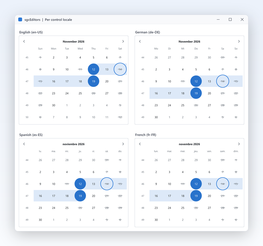
International teams and multilingual products need dates that read naturally for every user. Each control has its own FormatSettings, filled from the user locale and changeable at run time, so two controls on one form can even use two locales. The calendar and pickers take day and month names, date and time formats, AM and PM strings and separators from it. FirstDayOfWeek and WeekNumbering follow the locale or your choice, and numbers use the right decimal and thousand separators. The units, hints and accessible names stay your own properties, so you translate them with the rest of the form.

  • FormatSettings per control
  • FirstDayOfWeek: efdLocale or forced efdMonday
  • WeekNumbering: ewnISO8601 by default
  • TsgcEditorLocale for headless models
  • Right to left for Arabic and Hebrew: spin, dropdown and clear buttons move to the other side, sliders, ratings and the calendar run from the right, and the edit field reads right to left
Read the help topic
Data aware versions for your forms

Typing, language and data Registered only

Data aware versions for your forms

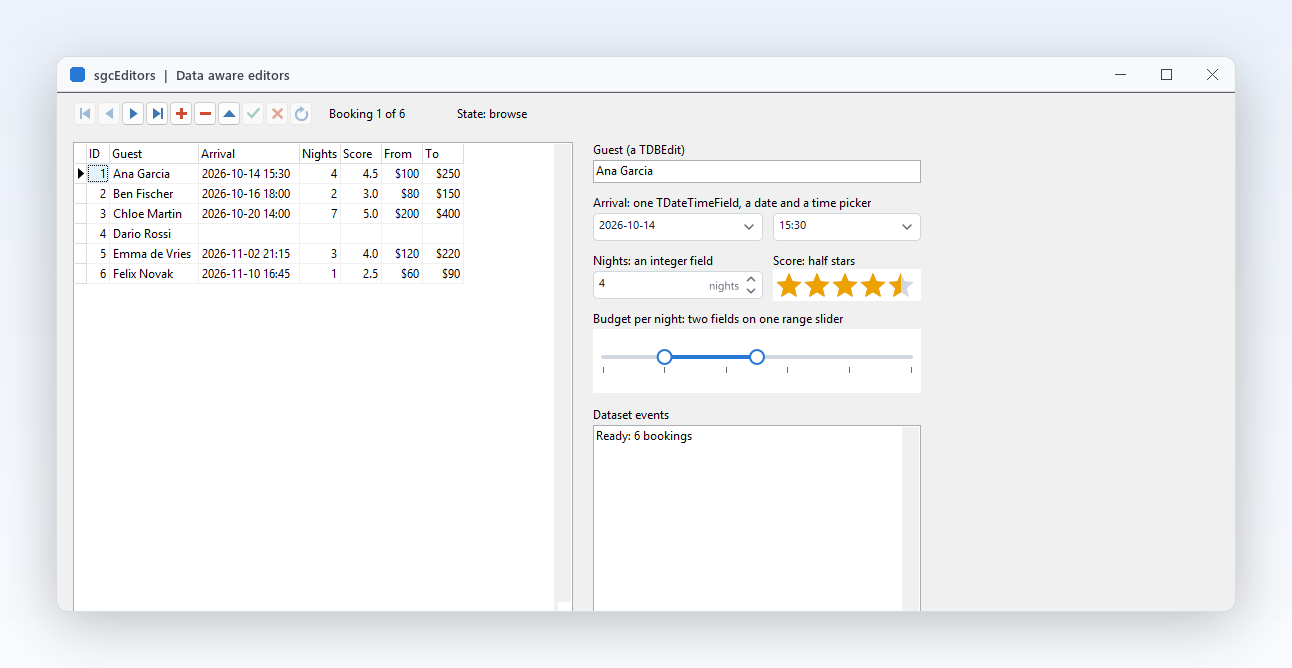
Most Delphi business forms sit on a TDataSet, and wiring every editor by hand is repetitive. Five data aware controls bind straight to a field through DataSource and DataField: a date picker, a time picker, a spin edit, a rating and a range slider whose second thumb binds EndDataField. Null fields show empty when AllowEmpty is on. They bind through TsgcEditorFieldLink, which uses only the DB unit, so the FireMonkey versions need no LiveBindings. In .NET the ordinary controls bind with the data binding of each framework. Drop them on an existing form and the dataset logic you already have keeps working unchanged.

  • TsgcVCLDBDatePicker, TsgcVCLDBTimePicker, TsgcVCLDBSpinEdit
  • TsgcVCLDBRating and TsgcVCLDBRangeSlider
  • DataSource, DataField, EndDataField
  • WPF: value properties bind two way

Community: the data aware units are empty; .NET data binding of the ordinary controls works in both editions.

Read the help topic

Keyboard, DPI and themes

The details reviewers check: no mouse needed, sharp on every monitor, and a look that matches your application.

Sharp on every monitor

Keyboard, DPI and themes

Sharp on every monitor

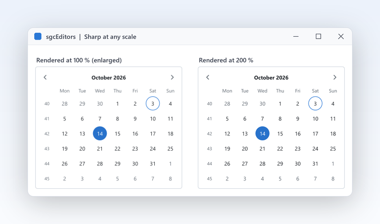
Laptops at 150 percent next to external monitors at 100 percent are normal now, and blurry inputs look cheap. sgcEditors lays every control out in logical pixels at 96 DPI and draws it at the scale of the screen, with nothing to do in your code. When a VCL form moves to a monitor with another DPI, the inner edit and its font scale with the control, and a drop down is drawn at the DPI of the monitor it opens on. FireMonkey rasters follow the scale of the scene for Retina and Android.

  • Layout in logical pixels, drawn at the screen scale
  • Inner edits rescale on WM_DPICHANGED
  • Drop downs use the DPI of their own monitor
  • SaveToPNG takes a scale for sharp images
Read the help topic
Keyboard and screen reader friendly

Keyboard, DPI and themes

Keyboard and screen reader friendly

No function of sgcEditors needs a mouse. The drawn controls take the focus themselves and the text controls forward it to their inner edit, and a focused control draws a 2 pixel focus ring in the accent colour. In the calendar the arrows move by a day or a week and skip disabled days, PageUp and PageDown move by a month, and Shift extends a range. In the pickers F4 or Alt+Down opens the drop down and Escape restores the value. The spin edit steps with Up, Down, PageUp and PageDown.

  • F4 or Alt+Down opens every drop down
  • Ctrl+Up zooms the calendar out to years and decades
  • Increment and LargeIncrement for the spin edit
  • Native edits keep screen readers working
Read the help topic
Light and dark with one property

Keyboard, DPI and themes

Light and dark with one property

Forms look finished when every input follows the same theme. Each control has a Theme, an AccentColor and a TextStyle, and the colours of the frame, hover, pressed state, selection and disabled state are derived from them, so one property changes the whole look. The tokens are the ones every sgcUI product uses, so editors placed in an sgcDashboard tile or under an sgcToolbar match without extra work. A disabled control blends towards the background on its own. Switch the theme at run time and every editor repaints, ready for a dark mode setting.

  • Theme: utDefault (default, follows the application theme), utLight or utDark
  • AccentColor for selection, thumbs, fill and focus ring
  • TextStyle for size, bold and colour
  • Same theme tokens as the whole sgcUI suite
Read the help topic

See sgcEditors in action

sgcEditors inside the sgcUI suite demos: complete applications that run offline with built-in simulated data.

Who Builds with sgcEditors

Booking and reservation forms

A booking form needs a stay range that respects closed days, a number of guests, an arrival time and maybe a rating of the last visit. The month calendar enforces MinDate, MaxRangeDays and disabled days, the spin edit counts guests, the time picker accepts typed times and the rating collects feedback, all in one theme. The BookingForm demo builds a hotel booking from seven editors with a live summary.

  • Calendar ranges
  • Spin edit
  • Rating
Run the BookingForm demo

Data entry on TDataSet

Line of business applications edit records all day. The five data aware editors bind to a TDataSet field through DataSource and DataField, the range slider binds both ends, and null fields show empty. Combined with real keyboard entry and lenient parsing, operators type values quickly and the dataset receives clean data. The DataAware demo puts the five editors on a TClientDataSet next to a TDBGrid and a TDBNavigator.

  • Data aware editors
  • Text entry
  • Keyboard
Run the DataAware demo

International scheduling apps

Planning tools used in several countries must show the right week start, week numbers and month names to every user. Each control carries its own FormatSettings, so one form can show a German calendar next to an English one, and FirstDayOfWeek and WeekNumbering follow the locale or your rule. The Calendar demo switches between English, German, Spanish, French and Italian with a range limited to 14 days.

  • Localisation
  • Week numbers
  • Disabled days
Run the Calendar demo

A Feedback Form in a Few Lines

The same API in Delphi, C++ Builder and C#: a rating, a range slider and a token edit, all reporting through OnChange.

uses
  SysUtils, Classes, Controls, Forms, StdCtrls,
  sgcEditors_Types, sgcEditors_VCL_Value, sgcEditors_VCL_Token;

type
  TFeedbackForm = class(TComponent)
  public
    Stars: TsgcVCLRating;
    Budget: TsgcVCLRangeSlider;
    Tags: TsgcVCLTokenEdit;
    Summary: TLabel;
    procedure EditorChange(Sender: TObject);
  end;

procedure TFeedbackForm.EditorChange(Sender: TObject);
begin
  // OnChange fires for every new value: clicked, dragged or typed
  Summary.Caption := Format('%.1f stars, budget %.0f to %.0f, %d tags',
    [Stars.Value, Budget.Value, Budget.EndValue, Tags.Tokens.Count]);
end;

function CreateFeedbackForm(aForm: TForm): TFeedbackForm;
begin
  Result := TFeedbackForm.Create(aForm);
  Result.Stars := TsgcVCLRating.Create(aForm);
  Result.Stars.Parent := aForm;
  Result.Stars.SetBounds(16, 16, 200, 32);
  Result.Stars.Glyph := ergHeart;
  Result.Stars.Precision := erpHalf;
  Result.Stars.Value := 3.5;
  Result.Stars.OnChange := Result.EditorChange;
  Result.Budget := TsgcVCLRangeSlider.Create(aForm);
  Result.Budget.Parent := aForm;
  Result.Budget.SetBounds(16, 60, 320, 48);
  Result.Budget.Max := 500;
  Result.Budget.Step := 10;
  Result.Budget.RangeMode := True;
  Result.Budget.Value := 80;
  Result.Budget.EndValue := 240;
  Result.Budget.ShowLabels := True;
  Result.Budget.OnChange := Result.EditorChange;
  Result.Tags := TsgcVCLTokenEdit.Create(aForm);
  Result.Tags.Parent := aForm;
  Result.Tags.SetBounds(16, 120, 320, 64);
  Result.Tags.TextHint := 'Add a tag';
  Result.Tags.AutoCompleteItems.CommaText := 'Breakfast,Parking,Pool';
  Result.Tags.AddToken('Breakfast');
  Result.Tags.OnChange := Result.EditorChange;
  Result.Summary := TLabel.Create(aForm);
  Result.Summary.Parent := aForm;
  Result.Summary.SetBounds(16, 196, 320, 20);
  Result.EditorChange(nil);
end;
#include <vcl.h>
#include "sgcEditors_Types.hpp"
#include "sgcEditors_VCL_Value.hpp"
#include "sgcEditors_VCL_Token.hpp"

class TFeedbackHandler : public TObject
{
public:
  TsgcVCLRating *Stars;
  TsgcVCLRangeSlider *Budget;
  TsgcVCLTokenEdit *Tags;
  TLabel *Summary;
  void __fastcall EditorChange(TObject *Sender);
};

void __fastcall TFeedbackHandler::EditorChange(TObject *Sender)
{
  // OnChange fires for every new value: clicked, dragged or typed
  Summary->Caption = FormatFloat("0.0", Stars->Value) + " stars, budget " +
    FormatFloat("0", Budget->Value) + " to " + FormatFloat("0", Budget->EndValue) +
    ", " + IntToStr(Tags->Tokens->Count) + " tags";
}

TFeedbackHandler * __fastcall CreateFeedbackForm(TForm *Form)
{
  TFeedbackHandler *H = new TFeedbackHandler();
  H->Stars = new TsgcVCLRating(Form);
  H->Stars->Parent = Form;
  H->Stars->SetBounds(16, 16, 200, 32);
  H->Stars->Glyph = ergHeart;
  H->Stars->Precision = erpHalf;
  H->Stars->Value = 3.5;
  H->Stars->OnChange = H->EditorChange;
  H->Budget = new TsgcVCLRangeSlider(Form);
  H->Budget->Parent = Form;
  H->Budget->SetBounds(16, 60, 320, 48);
  H->Budget->Max = 500;
  H->Budget->Step = 10;
  H->Budget->RangeMode = true;
  H->Budget->Value = 80;
  H->Budget->EndValue = 240;
  H->Budget->ShowLabels = true;
  H->Budget->OnChange = H->EditorChange;
  H->Tags = new TsgcVCLTokenEdit(Form);
  H->Tags->Parent = Form;
  H->Tags->SetBounds(16, 120, 320, 64);
  H->Tags->TextHint = "Add a tag";
  H->Tags->AutoCompleteItems->CommaText = "Breakfast,Parking,Pool";
  H->Tags->AddToken("Breakfast");
  H->Tags->OnChange = H->EditorChange;
  H->Summary = new TLabel(Form);
  H->Summary->Parent = Form;
  H->Summary->SetBounds(16, 196, 320, 20);
  H->EditorChange(NULL);
  return H;
}
using System;
using System.Drawing;
using System.Windows.Forms;
using esegece.sgcUICore;
using esegece.sgcEditors;

public class FeedbackForm : Form
{
    private readonly TsgcWinFormsRating stars;
    private readonly TsgcWinFormsRangeSlider budget;
    private readonly TsgcWinFormsTokenEdit tags;
    private readonly Label summary = new Label { Location = new Point(12, 196), Size = new Size(320, 20) };

    public FeedbackForm()
    {
        ClientSize = new Size(360, 230);
        stars = new TsgcWinFormsRating { Location = new Point(12, 12), Size = new Size(200, 32) };
        stars.Glyph = TsgcEditorRatingGlyph.ergHeart;
        stars.Precision = TsgcEditorRatingPrecision.erpHalf;
        stars.Value = 3.5;

        budget = new TsgcWinFormsRangeSlider { Location = new Point(12, 56), Size = new Size(320, 48) };
        budget.BeginInit();
        budget.Max = 500;
        budget.Step = 10;
        budget.RangeMode = true;
        budget.Value = 80;
        budget.EndValue = 240;
        budget.EndInit();
        budget.ShowLabels = true;

        tags = new TsgcWinFormsTokenEdit { Location = new Point(12, 116), Size = new Size(320, 64) };
        tags.TextHint = "Add a tag";
        foreach (string s in new[] { "Breakfast", "Parking", "Pool" })
            tags.AutoCompleteItems.Add(s);
        tags.Tokens.Add("Breakfast");

        // OnChange fires for every new value: clicked, dragged or typed
        foreach (TsgcWinFormsCustomEditor e in new TsgcWinFormsCustomEditor[] { stars, budget, tags })
        {
            e.OnChange = s => ShowSummary();
            Controls.Add(e);
        }
        Controls.Add(summary);
        ShowSummary();
    }

    private void ShowSummary() =>
        summary.Text = $"{stars.Value:0.0} stars, budget {budget.Value:0} to {budget.EndValue:0}, {tags.Tokens.Count} tags";
}
dotnet add package esegece.sgcEditors.WinForms

Run the sgcEditors Demos

Gallery, Calendar, BookingForm and DataAware ship for VCL and C++ Builder, plus GalleryFMX for FireMonkey; the .NET edition has Gallery for WinForms, WPF and Avalonia, BookingForm and BindingWpf.

Calendar

Calendar

A range of up to 14 days, week numbers, disabled weekends and holidays, and a locale switch between English, German, Spanish, French and Italian.

BookingForm

A hotel booking built from seven editors with a live summary of the stay, guests and arrival time. It shows how the controls work together on a real form.

DataAware

Registered only DataAware

The five data aware editors on a TClientDataSet with a TDBGrid and a TDBNavigator. The data aware controls need the Registered or Trial edition.

GalleryFMX

The gallery built with the FireMonkey editors, for Windows and Android, with the same properties and events as the VCL controls.

Compiled demos

Ready to run executables of every sgcUI product, nothing to install.

Download sgcUI_bin.zip →

Where sgcEditors Is Included

sgcEditors is in every sgcUI edition, and it is also sold on its own. sgcEditors is also included in the All-Access bundle.

sgcEditors single package

€199 / developer, full source code, 1 year of updates.

Buy sgcEditors → See pricing →

sgcUI Standard

sgcEditors, sgcGrid, sgcNavigation and sgcToolbar, from €380.

See Standard →

sgcUI Professional

Standard plus sgcCharts, sgcDashboard and sgcGauges, from €529.

See Professional →

sgcUI Enterprise

All 14 sgcUI products, from €699.

See Enterprise →

The free Community edition (esegece.sgcEditors.Community on NuGet) has all nine controls, but the colour picker has no HSV square and alpha bar, the token edit has no auto-complete list, the range slider has one thumb, and there are no data-aware editors.

FeatureCommunity (free)Registered
All nine controls for VCL, FireMonkey and .NET✓✓
Native text entry, lenient parsing, localisation✓✓
Calendar ranges, limits and disabled days✓✓
Keyboard, DPI, themes and headless output✓✓
Two thumb range slider−✓
HSV square and alpha bar of the colour picker−✓
Auto complete list of the token edit−✓
Data aware editors (Delphi and C++ Builder)−✓

Supported Frameworks and Platforms

Components in sgcEditors

Every control exists for VCL, FireMonkey, WinForms, WPF and Avalonia with the same properties and events.

ControlVCL and C++ BuilderFireMonkey.NET
Month calendarTsgcVCLMonthCalendarTsgcFMXMonthCalendarTsgcWinFormsMonthCalendar
Date pickerTsgcVCLDatePickerTsgcFMXDatePickerTsgcWinFormsDatePicker
Time pickerTsgcVCLTimePickerTsgcFMXTimePickerTsgcWinFormsTimePicker
Date and time pickerTsgcVCLDateTimePickerTsgcFMXDateTimePickerTsgcWinFormsDateTimePicker
Range sliderTsgcVCLRangeSliderTsgcFMXRangeSliderTsgcWinFormsRangeSlider
Colour pickerTsgcVCLColorPickerTsgcFMXColorPickerTsgcWinFormsColorPicker
Token editTsgcVCLTokenEditTsgcFMXTokenEditTsgcWinFormsTokenEdit
RatingTsgcVCLRatingTsgcFMXRatingTsgcWinFormsRating
Spin editTsgcVCLSpinEditTsgcFMXSpinEditTsgcWinFormsSpinEdit

The .NET column shows the WinForms names, the same controls exist for WPF and Avalonia with the prefixes TsgcWpf and TsgcAvalonia. Non visual helpers: TsgcEditorModel, TsgcEditorLocale and TsgcEditorFieldLink. The data-aware editors (TsgcVCLDBDatePicker, TsgcVCLDBTimePicker, TsgcVCLDBSpinEdit, TsgcVCLDBRating and TsgcVCLDBRangeSlider, plus the FireMonkey twins) are Registered only and exist for Delphi and C++ Builder.

TargetComponentPlatforms
Delphi 7 to 13, VCLTsgcVCL editorsWin32, and Win64 from XE2
Delphi XE6 to 13, FireMonkeyTsgcFMX editorsWindows, macOS, iOS and Android
C++ Builder 2007 to 13TsgcVCL and TsgcFMX editorsGenerated .hpp headers and static libraries
Delphi 10.2 to 13, framework neutralModels and headless PNG and SVG outputLinux64 (no Linux controls)
.NET Framework 4.7.2, .NET 8, 9 and 10WinForms, WPF and Avalonia editorsWindows desktop and Avalonia targets

Frequently Asked Questions

Yes. Every text field is a real edit of the platform, a borderless TEdit in VCL and an FMX TEdit in FireMonkey, so IME composition for Japanese, Chinese and Korean, the clipboard, undo, the context menu and screen readers work without special code. See Text entry and IME.

Yes. MinDate and MaxDate set the limits, DisabledDates lists holidays, DisabledWeekDays blocks weekends and OnIsDateDisabled decides any other rule. Disabled days are struck through, skipped by the keyboard and refused when typed into a picker. The Calendar demo blocks weekends and two holidays to show the rules at work.

Five, in Delphi and C++ Builder: the date picker, time picker, spin edit, rating and range slider, each as VCL and FireMonkey control. They need the Registered or Trial edition. In .NET the ordinary controls bind with the data binding of WinForms, WPF and Avalonia, in both editions.

All nine controls are included. Community leaves out the HSV square and alpha bar of the colour picker, the auto complete list of the token edit and the second thumb of the range slider. The Delphi data aware editors are Registered only. See Editions.

Yes. Each control keeps its own copy of FormatSettings, so day and month names, formats, separators and the first day of the week can differ per control. The Calendar demo switches between English, German, Spanish, French and Italian at run time, and week numbers follow ISO 8601 unless you choose otherwise.

For dates and times, yes: TsgcVCLDatePicker, TsgcVCLTimePicker and TsgcVCLDateTimePicker are typed edits with a drop down calendar or time list. On top they parse month names leniently, honour limits and disabled days, follow the sgcUI theme and are drawn at the DPI of each monitor.

Yes. C++ Builder 2007 and 2010 to 13 use the same VCL and FireMonkey controls through generated headers and libraries, and every Delphi demo, including DataAware, ships as a C++ Builder project too. The code tab on this page shows the same form in Delphi, C++ Builder and C#, and each sample was compiled before it was published.

sgcEditors Help

3,000+Developers
20+Years
761+Components
30+API Integrations
5Platforms
30-Day Money-Back GuaranteeNot satisfied? Request a full refund within 30 days of purchase. See refund policy

Try sgcEditors Today

The sgcUI trial includes sgcEditors and every other sgcUI product.