sgcUI sgcNavigation is available right now

sgcNavigation. Find every page. Fold into a rail.

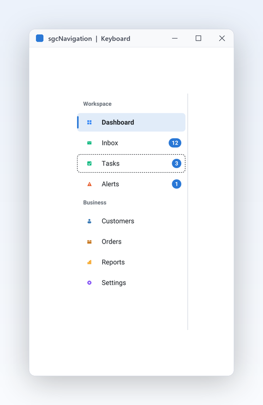
Give your application a modern navigation menu in minutes. One control is a sidebar or an accordion, folds into an icon rail with a smooth animation, shows badges for unread counts and works fully from the keyboard. Light and dark themes come built in.

  • VCL
  • FireMonkey
  • WinForms
  • WPF
  • Avalonia
  • Delphi 7 to 13
  • 2navigation styles in one control, sidebar and accordion
  • ~150 msto fold the bar into an icon rail, animated
  • 220 / 56logical pixels, expanded and collapsed width by default
  • 5UI frameworks: VCL, FireMonkey, WinForms, WPF, Avalonia

Everything an app menu needs.

Ten features that turn a list of pages into a navigation shell your users find their way around at once, on every framework.

  • Two styles, one control

    A sidebar or an accordion with the same items and events, switched by one property.

  • Every UI framework

    VCL, FireMonkey, WinForms, WPF and Avalonia, with the same model and names.

  • Matches the suite

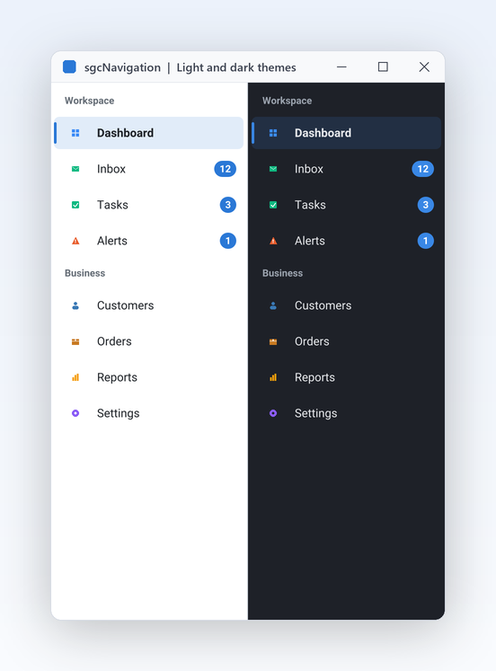
    Light and dark themes and an accent colour shared with every sgcUI product.

  • Headless output

    Render the same bar to PNG or SVG without a window, Linux64 included.

See it run.

Captured from the sgcNavigation demos that ship with the trial.

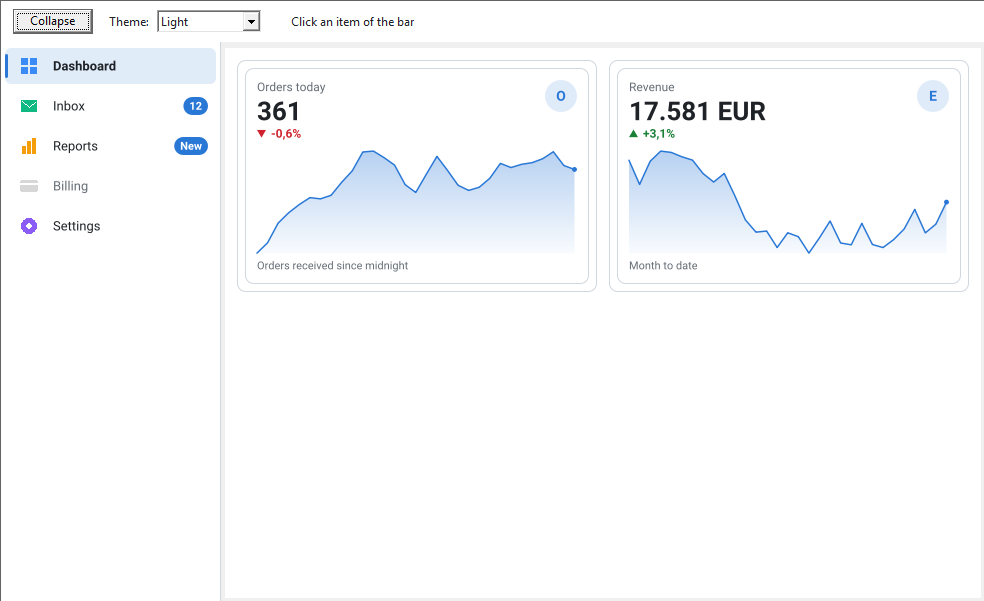
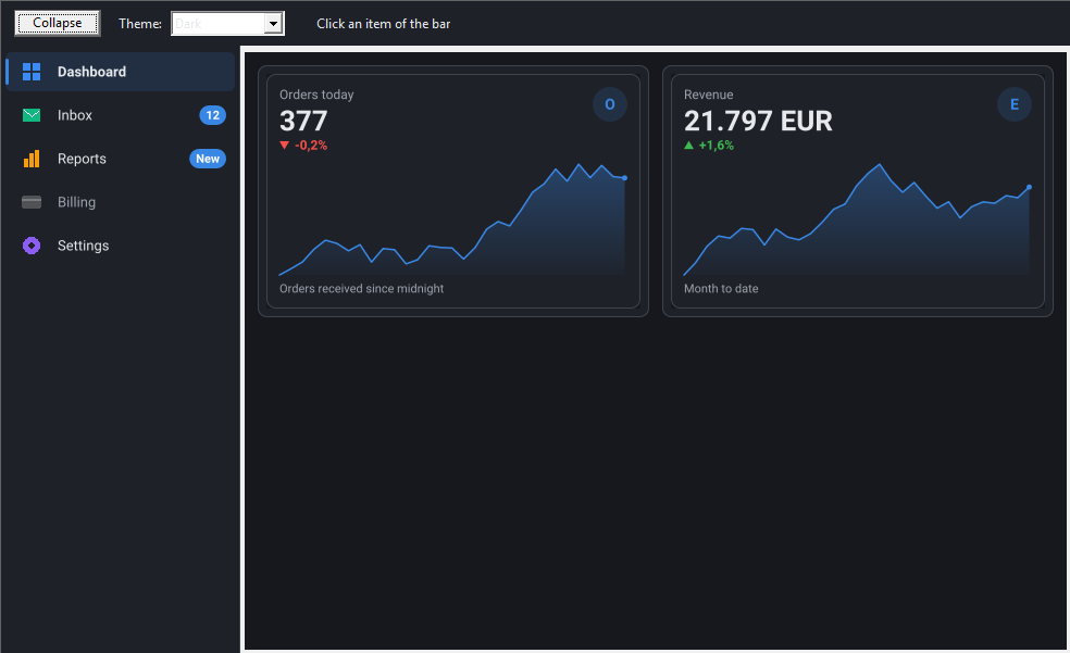
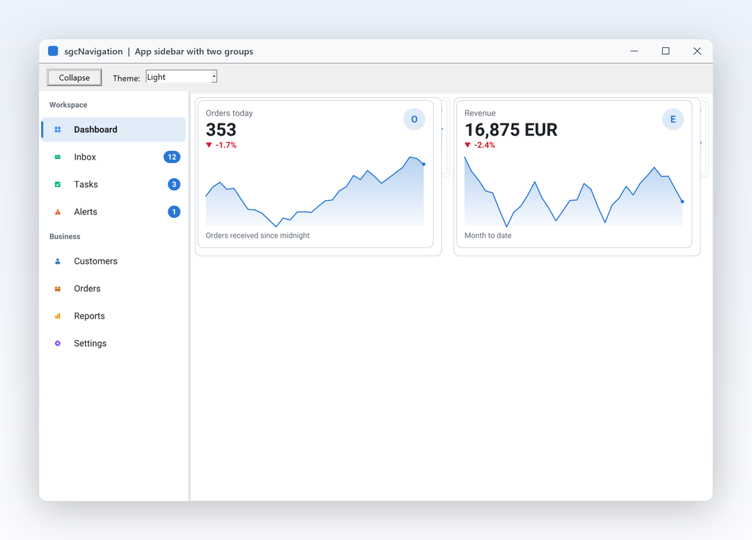
SidebarApp demo with a sidebar of 8 items in the Workspace and Business groups, Dashboard selected and two KPI cards on the right
Layout and modes

A modern app sidebar in one component.

  • Drop a TsgcVCLNavigationBar on the form, align it to the left and add the items; IsGroup turns an item into a group header.
  • The selected row gets an accent tinted background and a 3 pixel accent bar, so users always see where they are.
  • OnSelectionChange shows the matching page, for example a TPageControl with hidden tabs, as the SidebarApp demo does.
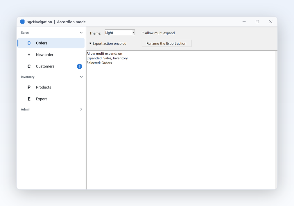
Mode = nbmAccordion with AllowMultiExpand: Sales and Inventory are open, Admin is closed
Accordion

Switch to an accordion with one property.

  • Mode := nbmAccordion turns every group header into a section that opens and closes the items below it.
  • Only one group is open at a time by default; AllowMultiExpand keeps several sections open together.
  • The items, the events and your code stay exactly the same, and both modes fold into the collapsed icon rail.
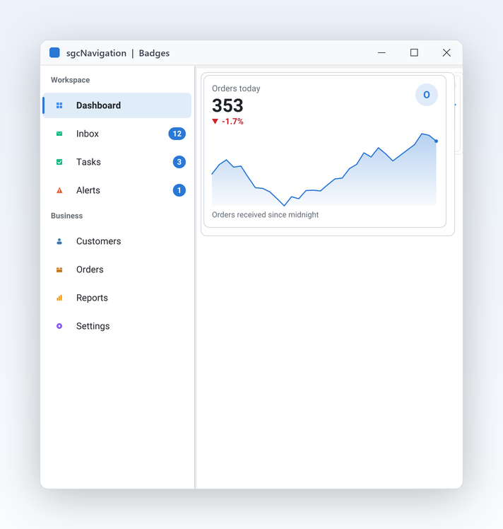
Set Badge on an item to show an unread count: Inbox 12, Tasks 3, Alerts 1
Items that inform

Badges, icons and your own TActions.

  • Badge draws an unread count or a word such as New as a pill in the accent colour, and a dot in the collapsed rail.
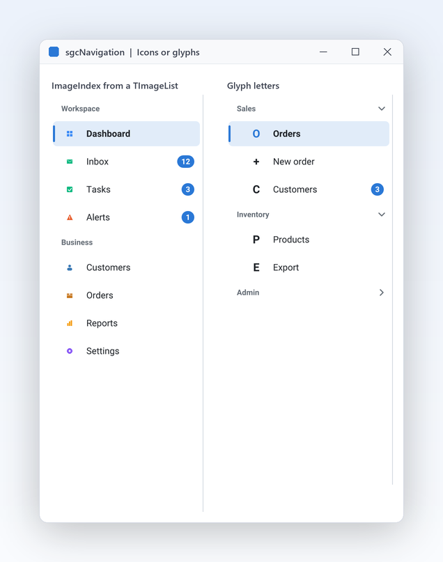
  • ImageIndex picks icons from the image list you already use, or a Glyph draws a letter with no image list at all.
  • Action links an item to any VCL or FireMonkey TAction; in .NET the same job is done by Command.
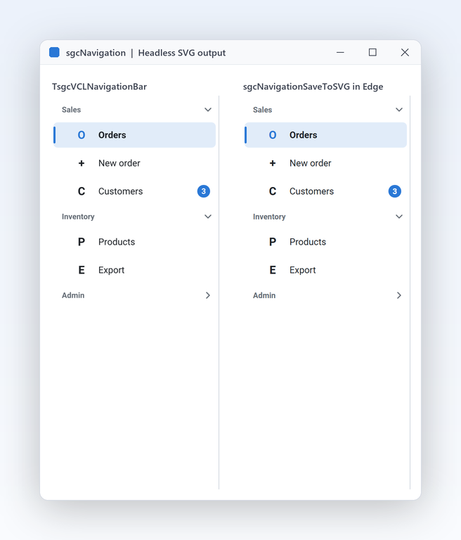
TsgcVCLNavigationBar on the left and the same bar written by sgcNavigationSaveToSVG and shown in Edge on the right
Keyboard, themes and output

Render the bar without a window.

  • sgcNavigationSaveToPNG and sgcNavigationSaveToSVG paint a model with no window and no VCL or FireMonkey.
  • The renderer builds on every platform, Linux64 included, so a console program, a service or a server draws the same bar.
  • A scale parameter gives sharp images for high DPI screens, and your image list supplies the same icons.

A navigation bar in a few lines.

An accordion bar with groups, a badge, a disabled item and a Collapse button. The same API in Delphi, C++ Builder and C#.

dotnet add package esegece.sgcNavigation.WinForms

C++ Builder and C# versions

procedure TMainForm.CreateNavigation;
begin
  // an accordion bar on the left, dark theme, several groups open at once
  FNav := TsgcVCLNavigationBar.Create(Self);
  FNav.Parent := Self;
  FNav.Align := alLeft;
  FNav.Mode := nbmAccordion;
  FNav.AllowMultiExpand := True;
  FNav.Theme := utDark;
  // a group header (third parameter True), then the items under it
  FNav.Items.AddItem('Sales', '', True);
  FNav.Items.AddItem('Orders', 'O');
  FNav.Items.AddItem('Invoices', 'I').Badge := '3';
  FNav.Items.AddItem('Admin', '', True);
  FNav.Items.AddItem('Users', 'U').Hint := 'Manage the users';
  FNav.Items.AddItem('Billing', 'B').Enabled := False;
  FNav.SelectedIndex := 1;
  FNav.OnSelectionChange := NavSelectionChange;
  FNav.AnimateCollapse := True;
end;

procedure TMainForm.ButtonClick(Sender: TObject);
begin
  // fold the bar into an icon rail, with an animation
  FNav.Collapsed := not FNav.Collapsed;
end;

Part of sgcUI.

Buy sgcNavigation on its own, or get it in every sgcUI edition from Standard up, next to the products that share its theme and runtime. Each comes with source code.

On its own

sgcNavigation

The navigation bar on its own, full source code and 1 year of updates.

€149 / developer
sgcNavigation pricing
Includes sgcNavigation

Standard

sgcGrid, sgcNavigation, sgcToolbar and sgcEditors.

€380 / developer
See Standard
Includes sgcNavigation

Professional

Standard plus sgcCharts, sgcDashboard and sgcGauges.

€529 / developer
See Professional
Includes sgcNavigation

Enterprise

All 14 sgcUI products.

€699 / developer
See Enterprise

For .NET, esegece.sgcNavigation.Community on NuGet is free, with everything except the Action links. sgcNavigation is also in the All-Access bundle.

Explore sgcUI

Put sgcNavigation in your own application today.

Download the trial and run the SidebarApp, Accordion and SidebarFMX demos, or browse every feature first.

Latest from the blog

View all posts →

You are seeing the sgcNavigation view of eSeGeCe.

Show me another angle →
30-Day Money-Back GuaranteeNot satisfied? Request a full refund within 30 days of purchase. See refund policy