sgcUI sgcToolbar is available right now

sgcToolbar. Commands on top. Live status below.

Build the frame of a desktop application with two controls that look the same on every UI. A toolbar with buttons, toggles, radio groups and dropdowns, and a real status bar with progress and indicator panels that a worker thread can update directly. Source code included.

  • VCL
  • FireMonkey
  • WinForms
  • WPF
  • Avalonia
  • Delphi 7 to 13
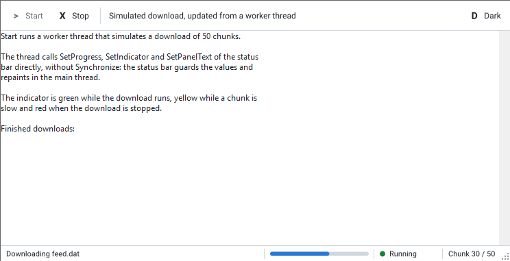
The LiveStatus demo: a worker thread simulates a download and feeds a text panel, a progress bar, a green Running indicator and a chunk counter in the status bar
  • 6toolbar item kinds: button, toggle, dropdown, separator, spacer, label
  • 3status panel kinds: text, progress and indicator
  • 0Synchronize calls to update the status bar from a worker thread
  • 5UI frameworks: VCL, FireMonkey, WinForms, WPF, Avalonia

The two bars every desktop application needs.

Commands at the top, state at the bottom, and work running in the background. sgcToolbar covers all of it with one item collection and one panel collection, on every framework.

  • Toolbar and status bar

    Six item kinds on top, text, progress and indicator panels at the bottom.

  • Thread safe status

    Set panel text, progress and indicators from worker threads, with no Synchronize.

  • Every UI framework

    VCL, FireMonkey, WinForms, WPF and Avalonia with the same item model.

  • Headless output

    Render both bars to PNG or SVG without a window, Linux64 included.

See it run.

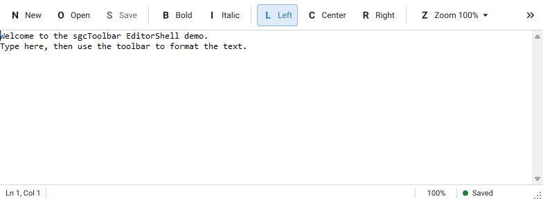
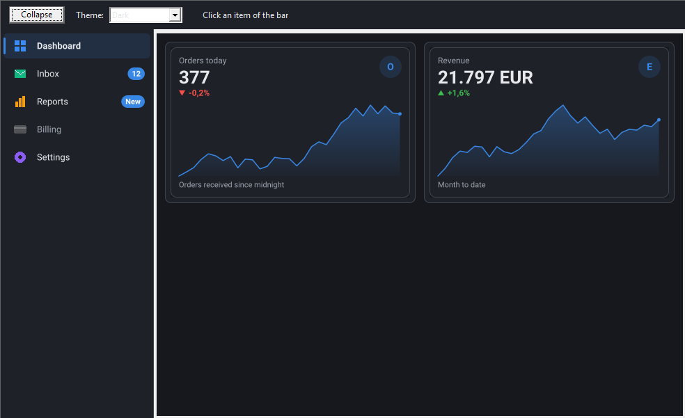
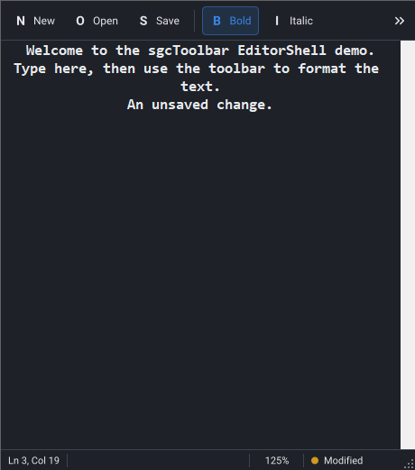
Recorded from the EditorShell and LiveStatus demos that ship with the trial.

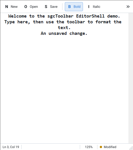
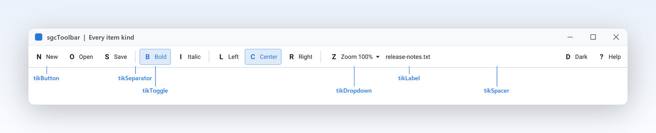
EditorShell toolbar at 2x with callouts on a button, toggle, separator, drop down, label and spacer
Commands

Every toolbar item kind in one control.

  • tikButton, tikToggle and tikDropdown for commands, tikSeparator and tikLabel around them.
  • tikSpacer takes the free width and pushes Help or a user name to the right edge.
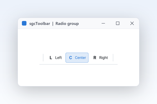
  • Give toggles the same GroupIndex and they form a radio group, with no event wiring.

Overflow

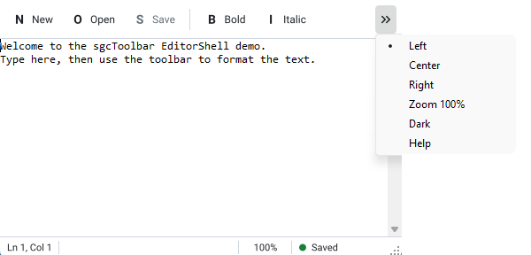
Items that do not fit move to an overflow menu.

  • A double chevron button shows OverflowMenu, built at run time with one entry per hidden item.
  • Choosing an entry acts exactly like a click: a toggle flips, OnItemClick fires and a dropdown shows its menu.
  • When the window grows again, the items return to the bar on their own.
spkText, spkProgress and spkIndicator panels: cursor position, 64 percent progress and a sisWarning indicator
Status bar

Status panels that lay themselves out.

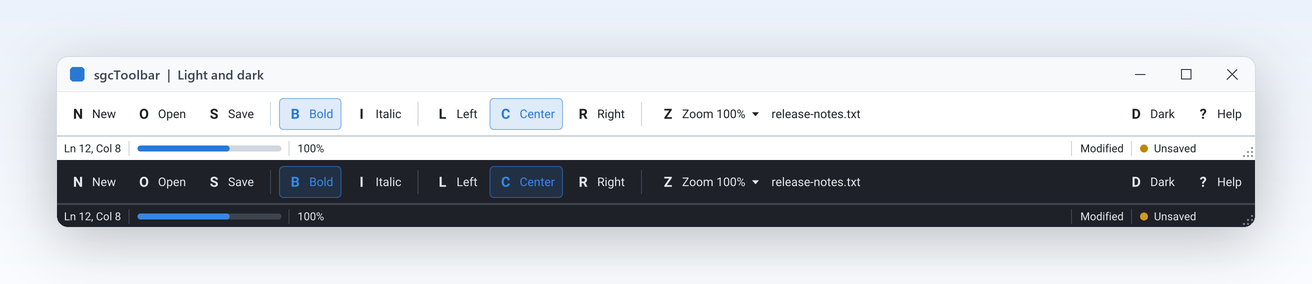
  • Fixed panels take their Width, AutoSize panels fit their text and Spring panels share what is left.
  • spkProgress fills to Progress percent in the accent colour.
  • spkIndicator shows a dot for sisOff, sisOk, sisWarning or sisError, tuned for light and dark.
Live status

Update the status bar from a worker thread.

  • SetPanelText, SetProgress and SetIndicator may be called from any thread with no Synchronize or Queue.
  • The model guards the values with a lock and fires OnChange only when a value really changed.
  • The bar repaints on the main thread, so the UI is never touched outside it.

A toolbar and status bar in a few lines.

A toggle, a radio group, a dropdown, and a status bar updated from the click handler. The same API in Delphi, C++ Builder and C#.

dotnet add package esegece.sgcToolbar.WinForms

C++ Builder and C# versions

procedure TMainForm.CreateBars;
var
  oItem: TsgcToolbarItem;
  oPanel: TsgcStatusBarPanel;
begin
  // a toolbar with a toggle, a Left/Center radio group and a dropdown
  FToolbar := TsgcVCLToolbar.Create(Self);
  FToolbar.Parent := Self;
  FToolbar.OnItemClick := ToolbarItemClick;
  oItem := FToolbar.Items.Add;
  oItem.Kind := tikToggle;
  oItem.Caption := 'Bold';
  oItem := FToolbar.Items.Add;
  oItem.Kind := tikToggle;
  oItem.GroupIndex := 1;
  oItem.Down := True;
  oItem.Caption := 'Left';
  oItem := FToolbar.Items.Add;
  oItem.Kind := tikToggle;
  oItem.GroupIndex := 1;
  oItem.Caption := 'Center';
  oItem := FToolbar.Items.Add;
  oItem.Kind := tikDropdown;
  oItem.Caption := 'Zoom';
  oItem.DropdownMenu := FZoomMenu;
  // a status bar: a spring text panel, a progress bar and an indicator
  FStatusBar := TsgcVCLStatusBar.Create(Self);
  FStatusBar.Parent := Self;
  oPanel := FStatusBar.Panels.Add;
  oPanel.Spring := True;
  oPanel.Text := 'Ready';
  FStatusBar.Panels.Add.Kind := spkProgress;
  FStatusBar.Panels.Add.Kind := spkIndicator;
end;

procedure TMainForm.ToolbarItemClick(Sender: TObject; aItem: TsgcToolbarItem);
begin
  // the setters are thread safe, a worker thread can call them directly
  FStatusBar.SetPanelText(0, aItem.Caption + ' clicked');
  FStatusBar.SetProgress(1, 60);
  FStatusBar.SetIndicator(2, sisWarning);
end;

Part of sgcUI.

Buy sgcToolbar on its own, or get it in every sgcUI edition from Standard up, next to the products that share its theme and runtime. Each comes with source code.

On its own

sgcToolbar

The toolbar and status bar on their own, full source code and 1 year of updates.

€149 / developer
sgcToolbar pricing
Includes sgcToolbar

Standard

sgcGrid, sgcNavigation, sgcToolbar and sgcEditors.

€380 / developer
See Standard
Includes sgcToolbar

Professional

Standard plus sgcCharts, sgcDashboard and sgcGauges.

€529 / developer
See Professional
Includes sgcToolbar

Enterprise

All 14 sgcUI products.

€699 / developer
See Enterprise

For .NET, esegece.sgcToolbar.Community on NuGet is free. sgcToolbar is also in the All-Access bundle.

Explore sgcUI

Put sgcToolbar in your own application today.

Download the trial and run the EditorShell, LiveStatus and EditorShellFMX demos, or browse every feature first.

Latest from the blog

View all posts →

You are seeing the sgcToolbar view of eSeGeCe.

Show me another angle →
30-Day Money-Back GuaranteeNot satisfied? Request a full refund within 30 days of purchase. See refund policy